As an Amazon Associate, we earn from qualifying purchases. Some links on this site are affiliate links at no extra cost to you. Our recommendations are based on thorough research and editorial judgment.
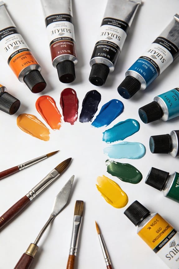
Warm vs. Cool Colors: Identifying Temperature in Paint Tubes
When selecting paint tubes, understanding warm and cool colors is essential. Warm colors like red and yellow evoke energy, while cool colors like blue and green offer calmness. To identify temperature, categorize your paints: warm colors often have a sunny, bright vibe, while cool colors tend to feel serene. Mixing similar temperatures produces vibrant results, while mixing opposing ones can create dullness. If you want to improve your mixing skills, there’s more to explore about effective techniques.
Key Takeaways
- Warm colors are typically reds, oranges, and yellows, while cool colors include greens, blues, and magentas.
- Categorizing paint tubes into warm and cool groups simplifies identification and reduces confusion while mixing.
- Look for color temperature labels or swatches on paint tubes to quickly identify their warmth or coolness.
- Keeping similar temperature colors together promotes harmony and maximizes vibrancy in your artwork.
- Regular practice and familiarity with color temperature enhance your ability to select and mix paints effectively.
Understanding the Difference Between Warm and Cool Colors
You may be interested

Have you ever looked at a painting or a room and just felt something? That’s usually thanks to the colors used. Understanding the basics of warm and cool colors can help you create that perfect vibe. Warm colors like red, orange, and yellow bring out feelings of energy and coziness, while cool colors such as green, blue, and magenta give off a calm, serene vibe.
So, why does this matter? If you’re mixing colors yourself, knowing about color bias can save you from a muddy mess. A warm yellow with a red tone will brighten things up, but if you go for a yellow with a green tone, it could feel cooler. When you mix colors that share the same warmth or coolness—like warm with warm—you often get these vibrant results that pop off the canvas.
Here’s the trick: watch what colors you’re pairing. Putting together warm colors can make them sing, but throwing in a cool color can dull them down. Keeping an eye on these color biases is key when you’re trying to build your palette.
In the end, playing around with warm and cool colors can really change how a space or a piece of art feels. Using the right pouring medium viscosity can also influence how these colors flow and blend on your canvas. So, next time you’re looking at colors, ask yourself: What mood do I want to create?
Recommended Products

Outdoor sauna: The overall size of the 4 person sauna is 62.2*46.85*81.89 inches. The excellent sound system allows you to enjoy the charm of sauna and music simultaneously. 2600w power quickly reaches the temperature you want. Adjustable from 68°F to 149°F.

🔥 MULTIPLE MOUNTING OPTIONS: The Modern Ember Skyline Linear Electric Fireplace is designed to either be fully or partially resessed into a wall and can even be placed on the corner of a wall to create a unique look. Not designed to be mounted directly on a wall.

50W 5500lm Hight Brightness - 1x4 LED Flat Panel Light Surface Mount: AIKVSXER Super Bright 1x4 Surface Mount LED Ceiling Light is designed with high-efficiency LED chips to replace traditional fluorescent light, high-efficiency (efficacy over 110LM/W) light source, reducing carbon emissions and your electric bill by 85%.
How Color Bias Affects Your Color Choices

Have you ever mixed paints only to find your colors come out muddy? It’s frustrating, right? Color bias can play a huge role in our choices, especially when we’re trying to create vibrant artwork. For instance, a red can lean either warm, thanks to a yellow bias, or lean cool with a blue bias. Understanding this can influence the brightness of your mixtures.
When you mix warm colors together or cool colors with cool ones, the results tend to be much cleaner. Think about it: if you’re mixing a warm red with a cool blue, you’re setting yourself up for a muddy mix. So, what’s the takeaway here? Stick to mixing colors that match in temperature for brighter, cleaner outcomes.
Now, if you’re working with budget-friendly paint tubes, grasping the concept of color bias becomes even more crucial. Often, these paints might not provide the exact hue you’re looking for. By recognizing their temperature, you can create harmony in your pieces, which ultimately leads to a more polished artwork.
Here’s the trick: never underestimate the impact of color bias. It can truly enhance your pieces and make your art stand out. Have you paid attention to how different colors interact in your work? Truth is, being aware of these factors can significantly elevate your painting game. Give it a shot next time you’re in the studio, and see how it improves your results! Additionally, choosing paints with high pigmentation quality ensures your colors remain vibrant and mix cleanly, reducing the chance of muddiness.
Why Understanding Warm and Cool Colors Matters for Artists

Ever wonder why some colors just seem to pop in your artwork while others fade into the background? Recognizing the differences between warm and cool colors can make a huge difference in your art. It’s all about creating visual harmony and giving depth to your paintings.
Here’s the trick: when you mix warm colors with other warm colors, or cool colors with cool ones, you often get vibrant, clean mixtures that really stand out. Think about how warm yellow differs from cool yellow—this subtle shift can completely change the vibrancy and tone of your painting.
Plus, those old insights from Sir Isaac Newton about color still apply today, influencing how we make choices while painting. One practical tip? Clearly categorizing your paint tubes as warm or cool can streamline your shopping trips and reduce confusion when it comes to using colors.
To ensure the best results in your artwork, selecting paints with high pigmentation is essential because it guarantees vibrant color output and coverage.
Recommended Products

SENNELIER French Artists WC Metal Set of 12-10ml Tubes

Van Gogh watercolors are a student and artist level range of paints featuring brilliant, transparent, and intense colors with high tinting strength.

36 Artist-grade Vivid Colors: Paul Rubens Watercolor adopts ultra-pure pigment which has been delicately grounding and makes it not easy to get grey or produce scrap, you can see there are no differences when it's wet or dry.
Expert Techniques for Mixing Warm and Cool Colors Effectively
Wondering how to make your artwork pop with color? Mixing warm and cool colors can really change the vibe of your pieces. If you’re aiming for harmony, try keeping your colors grouped with similar temperatures. Mixing warm with warm or cool with cool can lead to cleaner outcomes. But when you throw a warm red into the mix with a cool blue, things can get a little muddy. So, how can you avoid that?
Understanding color bias really helps here. For instance, if you mix a warm red that leans towards yellow with a cool yellow, you’ll end up with a vibrant orange. But if you chose a blue-biased red, that orange could turn out a lot duller. To visualize this, using color charts can be a handy trick. They sort colors by temperature, giving you a clearer idea of what you’re working with.
Bear in mind that the name of a paint doesn’t always reflect its true temperature. Context is important; what works in one piece might not work in another. As you experiment with these techniques, you’ll find exciting ways to create striking contrasts that elevate your art. Choosing paints with excellent lightfastness ratings can also ensure your color contrasts remain vivid over time.
Recommended Products

Art Gallery: The CanvasTV transforms any room into a curated gallery experience, displaying stunning artwork and photography when you're not watching. Choose from more than 1,000 complimentary curated works across styles and eras, or display your own photos and collections. Swap collections, rotate pieces and change the mood of any room. It's not just a TV. It's a piece of art.

【SAVE YOUR MONEY!!! Durable Booth, Reduce Replacement】①High strength 210D Oxford material+PU coatings used in the manufacturing of this booth make its more sturdy.②Come with well-crafted design allows for easier access for vehicle and painter.③the installation of heavy-duty double zippers make it can stand more pressure.④The paint booth includes hooks for hanging lamps or lightings to guarantee your visibility at night.⑤The top & bottom D-shaped rings make easy for you to fasten the booth.

Powerful 155W Dual Light & Super Large Illuminated - Honeywell 77.4'' standing lamp with double light source for optimal brightness. The 3376LM direct light, at a comfortable 4000K color temperature, provides natural and even illumination, thanks to micro-prism diffusers. Meanwhile, the 12624LM indirect light reflects off the ceiling to ensure consistent brightness throughout the room, minimizing eye strain and maintaining a pleasant ambiance. Whether for reading, working, or relaxing, this lamp creates the perfect lighting for any setting.
Mixing Color Combinations: What to Expect
When you dive into mixing colors in your artwork, it can feel overwhelming sometimes. Ever find yourself wondering why your mixes don’t turn out as expected? Here’s the deal: the secret’s in the temperature of the colors you’re using.
Try this: when you combine colors that share similar temperature biases—like warm yellows and warm reds—you’ll get vibrant mixes, often resulting in brilliant oranges. On the flip side, mixing a warm color with a cool one can lead to muddy tones that just don’t pop. Have you ever noticed how a yellowish red and a reddish blue can muddy things up? Understanding each color’s bias really helps avoid that issue and keeps your palette singing.
So, what can you do to make smarter color choices? A color wheel is a handy tool. It can guide you through and help you pick colors that will harmonize beautifully. Keep in mind that a cool yellow has a green bias, while a warm yellow leans toward red. By using these mixing strategies, you’re on your way to creating successful color combinations and enhancing your artwork in a fun and effective way.
Honestly, experimenting with color can be a bit of trial and error, but that’s part of the journey. Don’t be afraid to play around with different mixes. You might discover something unexpected that works beautifully! What will you try first? Remember that choosing paints with high pigmentation can significantly improve the vibrancy of your color mixes.
Should Paint Labels Indicate if Colors Are Warm or Cool?
Should Paint Labels Indicate if Colors Are Warm or Cool?
Have you ever found yourself standing in front of your paint collection, unsure of what colors to mix? It can be super confusing, right? Many artists believe that knowing whether a color is warm or cool would really simplify the painting process. Imagine if each paint tube had a clear label indicating its temperature. That would definitely make your color choices easier.
Warm colors like reds and yellows typically blend well together, while cool colors such as blues and greens do the same. So, why does this matter? This understanding is essential for achieving the look you’re going for without ending up with muddy mixes. Unfortunately, many paint labels don’t make the temperature clear, leading to mixing mistakes that can be frustrating.
Here’s the trick: if paint manufacturers labeled their products with temperature indications, it would serve as a helpful guide. Think about how much smoother your painting experience could be! You could avoid those moments of doubt and instead focus on creating something beautiful. Plus, you’d feel more confident when selecting your palette, knowing exactly how the colors will interact.
Frankly, a simple designation indicating a color’s temperature could save you a lot of headache. It’s a small change but one that can make a big difference in your artwork. Imagine how enjoyable your painting sessions could be with that extra clarity! Using tools with organized storage features can also help keep your supplies in order while you work.
Recommended Products

Ultimate package: Includes a portable stove, a durable padded carrying case for secure travel, and non-stick silicone baking pans for easy cleanup.

Artist Oil Paints : Meticulously developed one color at a time to elevate the painting experience

Set of 9 porcelain 150 glossy finish bullet tip markers for use on glass, china, porcelain, tile, metal, ceramic, and more
How to Fix Muddy Color Mixes in Your Paintings
What’s more frustrating than pouring your heart into a painting only to have it turn out looking dull and muddy? If you’re struggling with color mixes that just don’t pop, you’re not alone. Luckily, there are simple tips that can help brighten up your mixes and make your artwork sing.
Try using a color wheel to guide your decisions. It’s not just a tool for beginners; it can really help you distinguish between warm and cool colors. When you’re mixing, stick to similar temperatures—warm with warm and cool with cool. This will keep your colors vibrant and clear. Mixing a warm red with a cool blue, for instance, often leads to a less appealing tone that can muddy your palette.
Another key point is to watch for color bias. A cool yellow won’t mesh well with a warm yellow. Do you see where I’m going with this? If you mix colors with differing temperatures, you’re likely to end up with a mix that’s lifeless.
So, here’s the trick: Keep practicing these techniques consistently. As you do, you’ll notice your mixes becoming brighter and livelier, which can really elevate your pieces. Over time, you’ll develop a better eye for color, and your skills will naturally improve. Also, choosing paints with a high pigment load can significantly enhance the brilliance and clarity of your color mixes.
Recommended Products

Manufacturing process of the Sennelier cylindrical pastel does not compress the paste, and the pastel dries naturally in open air

【SAVE YOUR MONEY!!! Durable Booth, Reduce Replacement】①High strength 210D Oxford material+PU coatings used in the manufacturing of this booth make its more sturdy.②Come with well-crafted design allows for easier access for vehicle and painter.③the installation of heavy-duty double zippers make it can stand more pressure.④The paint booth includes hooks for hanging lamps or lightings to guarantee your visibility at night.⑤The top & bottom D-shaped rings make easy for you to fasten the booth.

🎨 THE BRAND: Schmincke has been producing the best, finest artists' colors Made in Germany since 1881 and they are available in over 60 countries. The range includes watercolors, acrylics, oil colors, pastels, gouache colors, airbrush colors and much more.
Frequently Asked Questions
How to Tell if a Paint Color Is Cool or Warm?
To tell if a paint color’s cool or warm, we’ll assess its bias using temperature impact analysis. Applying color harmony techniques, we can identify relationships between hues and create a balanced palette that resonates emotionally.
What Is the 60 30 10 Rule for Painting?
The 60-30-10 rule for painting helps us achieve color harmony. By using design principles that allocate 60% dominant color, 30% secondary, and 10% accent, we can embrace color psychology to create balanced, inviting spaces.
Is Paynes Grey Warm or Cool?
Payne’s Grey is a cool color with blue and green undertones. Its applications in landscapes and portraits help us create depth. When compared to warm colors, it effectively neutralizes without creating muddiness in our work.
What Are Warm and Cool Colors in Painting?
Imagine a sunset versus a tranquil sea; warm colors like red and yellow ignite passion, while cool colors like blue and green soothe. On our artist palette, understanding color theory helps us balance these temperatures effectively.


