As an Amazon Associate, we earn from qualifying purchases. Some links on this site are affiliate links at no extra cost to you. Our recommendations are based on thorough research and editorial judgment.
The Physics of Color: Subtractive vs. Additive Color Mixing
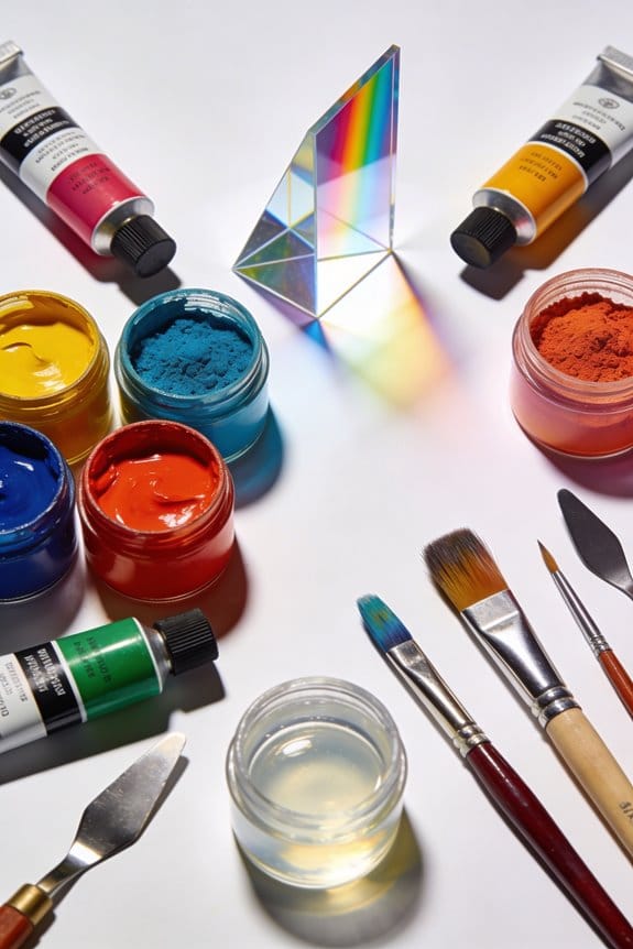
When we talk about color mixing, we focus on two methods: additive and subtractive. Additive mixing uses light, combining red, green, and blue (RGB) to create new colors; for example, mixing red and green gives yellow. Subtractive mixing involves pigments like cyan, magenta, and yellow (CMY), absorbing certain wavelengths. Mixing all three evenly results in a muddy color. Understanding these methods helps us choose the right palette for digital or print projects. There’s more to explore about their applications ahead!
Key Takeaways
- Additive color mixing uses red, green, and blue light, creating white when all are combined, ideal for digital screens.
- Subtractive color mixing relies on cyan, magenta, and yellow pigments, resulting in darker colors due to light absorption.
- Mixing methods differ, with RGB suited for digital applications and CMYK preferred for print to achieve vivid tones.
- Equal mixing of CMY colors can produce muddy black, while various combinations yield distinct primary and secondary colors.
- Understanding these methods enhances artistic expression and ensures accurate color representation in design and print materials.
What Is Color Mixing: Additive vs. Subtractive?
You may be interested


Have you ever wondered how colors mix together to create new shades? It’s pretty cool once you dive into it. There are two main ways colors combine: additive and subtractive, and understanding these can really help with your art projects or design work.
Additive mixing is all about light and it uses the primary colors red, green, and blue (RGB). When you mix these three together, you actually get white light! So, if you’re working with screens—like those on your phone or computer—this method is what you’re dealing with.
On the flip side, you have subtractive mixing, which is more about pigments and dyes. Here, the primary colors change to cyan, magenta, and yellow (CMY). Mixing these pigments absorbs certain light wavelengths and usually results in a darker color. Think about printed materials like posters and photos; they rely on this subtractive mixing to get those vibrant images.
So, why does this matter for you? Understanding how these mixing methods work is key to achieving the colors you want in your projects. Whether it’s painting, graphic design, or even crafting, knowing the difference can save you a lot of trial and error.
Try this: the next time you’re mixing colors, pay attention to whether you’re using light or pigments. The best part is that once you grasp these concepts, you’ll feel more confident in your color choices. Just remember: the colors on your screen act differently from those on the page. Using high pigmentation acrylic paints can help achieve vivid colors in your physical artwork, especially when working with wood or other surfaces.
How to Use Additive Color Mixing in Your Projects

When you’re diving into additive color mixing, it can feel like opening a box of colorful possibilities for your creative projects. Using the RGB color model, you can mix red, green, and blue light to pull together some eye-catching colors. Here’s a quick tip: equal parts of these colors create white light, while just mixing red and green gives you yellow.
To really bring your color choices to life, pay attention to how intensely each RGB component shines on screens or projectors. It’s interesting to consider that when you switch to subtractive formats, like CMYK for printing, the colors might not look the same anymore. So, why does this matter? Understanding these color mixing principles can help keep your designs consistent across different electronic displays, ensuring they look just as you envisioned.
Remember to experiment with different combinations. You might discover a shade you really love! And don’t forget to check how it prints, just in case it varies from how it appeared on the screen. So, what’s your next project? Let that colorful creativity flow! Also, selecting the right paint consistency and texture can make a big difference when transferring digital designs to physical mediums.
Understand the Principles Behind Subtractive Color Mixing

Ever wondered why paints or inks combine to create different colors? It’s pretty fascinating! In subtractive color mixing, pigments or dyes team up by absorbing certain wavelengths of light while reflecting others. The magic happens with three main colors: cyan, magenta, and yellow.
So, what do you get when you mix them? Here’s the breakdown:
- Magenta and cyan give you blue.
- Cyan and yellow result in green.
- Magenta and yellow produce red.
It’s crucial to keep in mind that when you blend all three primary colors equally, the outcome is less about vibrant color and more like a muddy black. Why does that happen? Well, the pigments soak up most wavelengths of light, making it tough to see any color at all.
You can see subtractive color mixing in action mostly in printing. Ever notice how overlapping colors create new shades? The thickness of those pigments matters too, as some will come out darker than others. Using acrylic mediums can influence the flow and spread of pigments, impacting the final color intensity and texture in artwork.
When to Use RGB vs. CMYK in Your Creative Projects
Have you ever found yourself confused about which color model to use for your project? When it comes to digital graphics, you really want to stick with RGB, which stands for Red, Green, and Blue. This is an additive color model perfect for screens, helping you create bright and vibrant images by mixing different levels of light from those primary colors. It’s quite straightforward when designing for the web or social media.
On the flip side, if you’re getting into print products, that’s where CMYK steps in, which stands for Cyan, Magenta, Yellow, and Black. This is a subtractive color model designed specifically for mixing pigments. It delivers darker and richer tones that look great on paper. So, if you’re working with printed materials, make sure to convert your RGB files to CMYK early in the process.
Here’s a little tip: colors that look stunning on screens often don’t translate the same way in print. It’s all about how light and pigment mix differently. So, don’t set yourself up for disappointment; always check your colors in print to see how they really perform.
In short, choosing the right color model for your project matters a lot. It can mean the difference between a stunning design and something that just doesn’t pop. Have you thought about your next project yet? When mixing physical paints, consider the pigmentation quality as it affects color vibrancy and blending outcomes.
Explore Practical Applications of Color Mixing in Design and Art
Got an art or design project and struggling with color choices? You’re not alone! Color mixing is super important in both fields, and understanding the different techniques can really help your work stand out.
In design, there are two main types of color mixing: additive and subtractive. Additive mixing happens with RGB, which is used for screens. This method combines light to create bright and vibrant colors. On the other hand, subtractive mixing involves CMYK and focuses on how pigments absorb light. This process gives you deeper and richer colors, perfect for print materials. Knowing the differences between these methods can really streamline your creative process.
When you mix primary colors, you get a wide range of colors, and the results can surprise you. The way you mix them matters a lot! Using tools like color wheels can make a big difference. They help you visualize how colors relate to one another, making it easier to come up with a balanced color scheme that works.
Here’s the trick: if you’re ever stuck on colors, think about what you want to convey. Do you want a calming vibe or something more energizing? Everyone can have their own style, but understanding the basics of color mixing can elevate your art and design projects.
Truth is, color isn’t just about looking good. It can tell a story and add emotion to your work. So, whether you’re creating a digital piece or working on a canvas, master the art of color blending, and you’ll see how it adds depth and mood to your creations.
In short, getting to know color mixing can truly enhance your design and art skills. To really bring those colors to life, using high-quality tools like brushes with durable synthetic bristles can make all the difference in your painting technique. What colors are you excited to experiment with next?
Recommended Products

Double-Sided Artist Color Wheel: A versatile, 9-1/4" diameter color wheel for artists, students, and teachers. It's an essential color tool for painters, and interior designers, and crafers illustrating how to mix 60 colors

One 9-inch Mohawk Finishing Products Finisher's Colorwheel to help you find the color you need every time

Frequently Asked Questions
What Are the Historical Origins of Additive and Subtractive Color Mixing?
The historical origins of additive and subtractive color mixing intertwine artistic techniques, scientific discoveries, and ancient practices. Through technological advancements and cultural influences, color theory evolved, shaping our understanding of color’s impact on visual experiences.
How Do Different Lighting Conditions Affect Color Perception?
Different lighting conditions greatly affect our color perception. Depending on illumination types, lighting effects can create color contrast, influence environmental influence, and impact color harmony, ultimately leading to visual consistency or disruption in our experiences.
Can Color Mixing Principles Be Applied to Other Senses, Like Sound?
Just like we blend colors for visual harmony, we can mix sound frequencies to evoke emotional resonance. Auditory “colors” meld with taste associations, enhancing our sensory integration and enriching our experience of music and life.
What Is the Role of Color Temperature in Color Mixing?
Color temperature influences how we perceive colors from various light sources. On the Kelvin scale, warm colors create cozy atmospheres, while cool colors provide clarity. Understanding contrast effects helps us enhance visual perception in our designs.
How Do Cultural Differences Influence Color Interpretation and Meaning?
We’ve noticed that cultural differences profoundly shape how we interpret colors. Traditional meanings can vary widely, influenced by language and color symbolism; our perceptions adapt, uncovering a rich tapestry of global interpretations and emotional responses.


