As an Amazon Associate, we earn from qualifying purchases. Some links on this site are affiliate links at no extra cost to you. Our recommendations are based on thorough research and editorial judgment.

Understanding Simultaneous Contrast in Design
Understanding simultaneous contrast in design is essential for effective color use. It refers to how colors affect each other based on their surroundings. For instance, a gray square looks lighter against black than against white. By mastering this concept, we can enhance visibility and emotional connection in our designs. Using contrasting colors can create engaging visuals. With strategic spacing and color combinations, we can elevate our work’s impact. There’s much more to explore about applying these techniques successfully.
Key Takeaways
- Simultaneous contrast refers to how colors influence perception based on their surrounding hues, enhancing visual engagement and clarity in design.
- Complementary colors placed side by side can amplify each other’s intensity, creating a more dynamic visual experience.
- Adequate spacing around colors prevents cramping and allows each hue to stand out distinctly.
- Understanding value—lightness and darkness—of colors is crucial for effective color manipulation and perception in design.
- Neglecting the principles of simultaneous contrast can result in unclear designs and diminish overall effectiveness.
What Is Simultaneous Contrast and Why Does It Matter?
You may be interested


Have you ever noticed how colors can completely change their vibe just based on what’s around them? That’s the essence of simultaneous contrast. It’s a cool trick of the eye where colors, when placed next to one another, influence how we see them. Take, for instance, a gray square. It can appear lighter if it’s against a black background but looks darker when it’s next to white. Pretty interesting, right?
So, why does this matter? Understanding how colors work together can really boost your design game. You might find that knowing about color theory and complementary colors can make a huge difference in your projects. Here’s the trick: when you use simultaneous contrast well, your colors can really stand out, giving your design a vibrant feel.
When you create visuals that pop, it hooks people in. It’s not just about aesthetics, either. Thoughtful color use can improve how viewers emotionally connect with what they’re seeing. It’s a simple tool, but it can elevate your communication in design dramatically.
To sum it up, mastering simultaneous contrast can help you make more engaging designs. You’ll find that your work resonates better with your audience. So, what colors are you trying to pair next? How can you enhance your next project by playing with their contrasts? Also, using high-quality pigments and understanding the quality of pigments can make your colors appear more vibrant and effective in designs.
The Science Behind Color Perception in Design

Have you ever wondered why some colors just seem to pop when placed next to each other? Color perception is a fascinating blend of how our eyes and brains work together to make sense of what we see. It all revolves around cone and rod cells that detect different colors, relying on red, green, and blue receptors. These receptors create a contrast between neighboring colors, making their appearances shift in surprising ways.
One reason for this is a phenomenon called simultaneous contrast. When colors sit side by side, we tend to exaggerate the differences, which sharpens the edges and changes how bright things look. Michel Eugène Chevreul demonstrated this beautifully, proving that our brains play tricks on us. So, why does this matter? If you’re a designer, understanding how these interactions work can be incredibly helpful.
Try this: use contrasting and complementary colors in your designs. Doing so can enhance visual impact, grabbing attention and making your message clearer. When colors clash or complement each other, it creates a dynamic visual experience that speaks to viewers. The best part? You can communicate your ideas in a way that’s not only clear but also powerful.
Think about it: colors are more than just pretty visuals. They’re tools for effective communication. So, the next time you’re working on a design, pay attention to the colors you choose. Experiment with contrasts and see how they affect the overall feel of your work. For artists, selecting high-concentration inks can similarly amplify color vibrancy and visual effect in their projects.
How to Use Simultaneous Contrast to Enhance Designs

When you’re working on a design, have you ever noticed how some colors just pop while others seem flat? That’s where simultaneous contrast comes into play. By using this technique, you can really boost the perception of color saturation and brightness. When colors sit next to each other, they can look super vibrant, almost like they’re speaking to one another.
One thing to remember is the value scale; creating a stark contrast between dark and light elements makes everything easier to see. Want your design to grab attention? Try incorporating complementary colors—they work wonders for creating visual interaction, especially for those crucial elements you want to stand out.
Here’s the trick: isolating color areas with some blank space around them can make your design clearer and easier to read. This doesn’t just add to the design; it can give it a dynamic feel that catches the eye. Balancing both chromatic (colored) and achromatic (black, white, gray) colors can really enhance your compositions. You want your design to evoke emotions, right? This balance can help you achieve that.
For enhancing color vibrancy and flow in your design applications, consider using acrylic pouring mediums to create smooth, glossy finishes that amplify visual impact.
Recommended Products

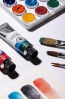
📝 NEW FORMULA 📝 - Our goal with Speedpaint was to create the first true single-coat acrylic plastic paint solution. To achieve this, this set of acrylic paints needed to offer superior coverage, vibrant saturation and a smooth, rustproof finish. By using an advanced resin, we were able to achieve the superior characteristics of Speedpaint while also making the paint more durable.

🎨 THE BRAND: Schmincke has been producing the best, finest artists' colors Made in Germany since 1881 and they are available in over 60 countries. The range includes watercolors, acrylics, oil colors, pastels, gouache colors, airbrush colors and much more.

Casting and pouring - medium - for flow technology and casting applications with acrylic paints
How Value Keys Enhance Color Complementation
Are you struggling to make your designs stand out? Understanding value keys can really help improve those design skills. Value keys categorize color brightness, which lets you see how colors interact and complement each other. Have you ever noticed how pairing colors can completely change your design’s vibe?
When you grasp the relative values of hues, you can manipulate visual perception like a pro. For example, pair a light yellow with a deep purple. The contrast not only highlights each color’s unique qualities but also draws the eye in. It’s a simple trick but one that makes a huge difference.
Here’s something to keep in mind: using complementary colors along with those value differences can really ramp up the intensity of your designs, making them more engaging. You might also want to consider the spacing around these color areas. Adequate spacing helps prevent your visuals from feeling cramped and can enhance their overall effectiveness.
Choosing high-quality acrylic paints with excellent pigmentation quality ensures your colors maintain vibrancy and clarity when applied, enhancing how value contrast appears in your designs.
Isolate Colors to Maximize Impact
Have you ever felt like your designs just aren’t grabbing attention the way you want? One simple way to change that is by isolating colors. When you create enough white space or play with tonal values, you can actually make colors stand out more. This technique makes them pop right off the page or screen, which is something every designer should aim for.
So, how do you do it? Start by considering your background. If you can isolate colors against a plain or contrasting backdrop, they become the focal point of the design. Think about it: when key color elements in a logo are separated from busyness, they naturally draw the eye. Adding complementary colors around these isolated areas can really kick things up a notch, creating those striking visuals that keep people engaged.
Here’s the trick: use value keys as a tool to assess your colors. This helps point you in the right direction for isolating colors effectively. And let’s face it, who doesn’t want their designs to be not just pretty but super engaging too?
Frankly, understanding these basic concepts can really make a difference in your work. By isolating colors judiciously, you’ll create designs that not only catch attention but also spark interest. So, what’s stopping you from trying this in your next project? Using the right consistency and texture can also enhance how colors and elements interact visually.
Practical Tips for Using Simultaneous Contrast
Ever wonder why some colors just pop in certain designs while others seem to fade away? It’s all about using simultaneous contrast to your advantage. Instead of simply throwing colors together, think about how they interact.
To really make colors stand out, try isolating them. Providing enough space around each color can highlight its beauty. And don’t underestimate the power of complementary colors; when you place them side by side, their intensity can skyrocket. Understanding value—the lightness and darkness of colors—is crucial, too. Adjacent colors can change how we perceive each other. For example, pairing a warm color next to a cool one can create a dynamic look that grabs attention.
So, how can you experiment with this? Mix and match different combinations in a sketchbook or even with digital tools. You’ll be amazed at how color interactions can evoke different feelings and vibes in your designs. This is a fun and creative process that can lead to some exciting results. Incorporating a variety of color palettes can enhance your creative exploration and help you discover unique contrasts.
Recommended Products

Ultra-High 1280×1024 Thermal Sensor: Premium 12μm VOx detector delivers exceptional image detail, superior target recognition, and outstanding thermal sensitivity.

HD Thermal Imaging & Recording: The Merger LRF XT50 binoculars feature a 1280x1024/12µm HD thermal sensor for sharp, detailed visuals. With a built-in photo and video recorder and 64GB of memory, capture and store high-quality footage effortlessly.

TURN YOUR DAY SCOPE INTO A THERMAL OPTIC IN SECONDS — Clip-on design mounts in front of your existing scope without affecting zero, magnification, or reticle. Keep the optic you trust and add thermal only when you need it.
Top 5 Mistakes to Avoid When Applying Color Contrast
When you’re diving into the world of color contrast, it’s easy to make a few missteps that can throw off your designs. One common pitfall? Not assessing the value of your colors properly. If adjacent hues don’t have enough contrast, important elements can become hard to see. Have you ever looked at a design and thought, “What’s even happening here?” That usually stems from a lack of color distinction.
Don’t forget about the impact of surrounding colors, either. Sometimes colors that look bright and vibrant can seem muted or dull when paired with certain shades. It’s like when you put on a shirt that you love only to realize it doesn’t pop against the walls in your house. So, how can you avoid this? Try to test your color combinations in various environments to see how they vibe together under different lighting.
Another thing to watch out for is overloading your design with complementary colors. It can be tempting to mix them freely, but without balancing them with readable text, your design can end up looking chaotic and confusing. The best part is, clarity doesn’t have to suffer for beauty—there’s a way to make them work harmoniously.
Speaking of clarity, have you thought about principles of simultaneous contrast? Neglecting them could limit how effective your color choices are. Thoughtful interactions between colors create visual interest and draw the viewer’s eye. So, next time you’re in the process of designing, keep this in mind.
In addition to color theory, using tools like refillable markers can give artists precise control over color application and consistency in their work.
In the end, by steering clear of these common mistakes, you can create designs that really shine. Asking yourself, “How can I make this stronger?” can lead to impressive results.
Recommended Products

[This is a Copilot+ PC] — A new AI era begins. Experience enhanced performance and AI capabilities with Copilot+ PC, boosting productivity with security and privacy in mind.

UNMATCHED TACTICAL AWARENESS: Harness the power of the Boson 12μm thermal core to spot suspects and wildlife in total darkness. Whether you're on a midnight patrol or scouting trails, this monocular provides sharp detail through smoke and fog.

New AI era with Copilot+ PCs: Powered by the Snapdragon X Elite processor, delivering 45 Trillion Operations Per Second of NPU performance. Transform ideas into artwork, search effortlessly across time with Recall, and understand new languages instantly with Live Captions
Resources for Further Learning About Color Theory
Ever find yourself confused about why certain colors just don’t seem to work together? You’re not alone! Color theory can feel overwhelming at first, but luckily, there are plenty of resources out there to help you navigate this fascinating subject.
Try exploring free online minilessons that break down essential topics, like simultaneous contrast and color interactions. You’ll get a clearer idea of how colors play off each other. Also, check out The Color Codex, which is currently crowdfunding for extensive video content covering nine different aspects of color theory.
Want to dive deeper? The Envato blog has tons of articles that tackle intermediate and advanced concepts. Engaging with these resources can truly enhance your understanding. Another way to make it stick is to participate in interactive workshops. These sessions often use real images to help you practice what you’ve learned, allowing you to see how colors maintain their individuality when next to each other and how they can stir emotions.
So, why does this matter? Because knowing how to use color effectively can seriously elevate your design skills. Honestly, investing time in learning color dynamics not only bolsters your confidence but also opens up a world of creative possibilities.
In short, there’s a wealth of knowledge waiting for you on color theory. Additionally, understanding the role of oil paint thinners in adjusting paint flow and consistency can aid artists in visually exploring color relationships more effectively. What resource will you explore first?
Recommended Products
WIDE COMPATIBILITY – This 20-piece engine oil funnel kit includes 12 color-coded adapters designed to fit a wide range of vehicles including GM, Ford, BMW, Audi, Toyota, Honda, Nissan, Hyundai, Mercedes, Volkswagen and more, making oil changes easier across multiple platforms

BUILD THREE FUN STICKER MOSAIC PICTURES WITH NO GLUE- Use over 600 included foam stickers to decorate the color coded picture scenes. Each picture is made of sturdy cardboard and decorated adventure scenes of pirate ships and treasure hunts. Stickers have matte, glitter, and glossy finishes for hours of crafting fun.

BUILD 38 MODELS & RUN 37 EXPERIMENTS ACROSS 5 PHYSICS CHAPTERS – Progress from gravity and inertia through simple machines, gears and energy transfer, forces at work, and centrifugal force — each chapter building on the last for a complete mechanical physics education
How to Incorporate Color Theory Into Your Projects
Do you ever stare at a design and feel like something’s off, but you can’t quite put your finger on it? Understanding color theory can really make a difference in your projects, turning something good into something truly engaging. One concept to consider is simultaneous contrast—where the colors next to each other can change how we perceive their brightness. By using a value scale, you can play around with contrast levels to grab your viewer’s attention.
Chemist Michel showed us an interesting thing: complementary colors can really pump up each other’s vibrancy when used in graphic design. So when you’re choosing colors, keep that in mind! And don’t forget about the importance of space. Giving your color areas some breathing room not only enhances clarity but also improves readability.
Want to get a better sense of how these colors interact? Try this: paint squares of primary and complementary colors. It’s a fun exercise that lets you see firsthand how colors influence one another.
As you embark on creating your designs, think of it as weaving a tapestry. Each color selection contributes to the overall picture, making it seamless and captivating. So, how can you use color in your next project to create that “wow” factor? Keep experimenting and have fun! Using high-quality acrylic paints can also enhance the vibrancy and longevity of your color choices.
Recommended Products

🎨 THE BRAND: Schmincke has been producing the best, finest artists' colors Made in Germany since 1881 and they are available in over 60 countries. The range includes watercolors, acrylics, oil colors, pastels, gouache colors, airbrush colors and much more.

Comprehensive 36-Color Set - The Alphanamel Monster Pack Enamel Paint Set includes 36 vibrant, oil-based colors in convenient 2.5 oz bottles. Perfect for hobbyists, model enthusiasts, and professional artists, this set offers a wide array of hues for various creative projects, from intricate details to large-scale works.
Glow in the dark paint, the number 1 choice acrylic glow paint - PRO-series
Frequently Asked Questions
How Does Simultaneous Contrast Affect Visual Perception in Everyday Life?
Simultaneous contrast shapes our color perception, like a painter’s palette. It influences visual harmony and light, evoking emotional responses in everyday designs. By embracing this, we optimize our experiences and enrich our surroundings together.
Can Different Cultures Interpret Color Contrasts Differently?
Absolutely, different cultures interpret color contrasts uniquely. We see cultural color perception influenced by color symbolism variations and regional design preferences, leading to diverse emotional responses and contrast appreciation across various societies.
What Is the History Behind Simultaneous Contrast in Art?
Simultaneous contrast emerged from color theory, influenced by artistic movements like Impressionism. Historical influences shaped our understanding, revealing visual illusions through critical analysis, allowing us to see how colors interact in fascinating ways throughout art history.
How Does Simultaneous Contrast Influence Branding and Advertising?
Simultaneous contrast shapes branding and advertising by leveraging color psychology to enhance brand identity. It evokes emotional responses, bolstering design aesthetics and refining our advertising strategy to capture attention and resonate deeply with audiences.
Are There Tools to Visualize Simultaneous Contrast Effects Digitally?
Yes, there are digital tools for visualizing simultaneous contrast effects! We can use interactive software and visual simulations to explore color palettes, enhancing our graphic design skills and understanding color interactions better in our projects.


