As an Amazon Associate, we earn from qualifying purchases. Some links on this site are affiliate links at no extra cost to you. Our recommendations are based on thorough research and editorial judgment.
High Key vs. Low Key: Understanding Value Ranges
When we explore high key and low key techniques in art, we notice their value ranges greatly impact mood. High key artworks use lighter values, from 6 to 10, creating a bright and cheerful feel. In contrast, low key art focuses on darker values, often below the midpoint, introducing depth and drama. Understanding these techniques can enhance our art’s emotional appeal. Stay with us, and we’ll break down effective strategies for both styles.
Key Takeaways
- High key techniques utilize light values ranging from 6 to 10, creating a bright and airy atmosphere in art and photography.
- Low key techniques focus on darker values below the midpoint, enhancing drama and emotional depth through shadows and contrast.
- High key art generates calmness and positivity, while low key art evokes mystery and introspection through its use of light and shadow.
- Both high key and low key approaches can significantly influence viewer perceptions and emotional connections with the artwork.
- Practicing distinct value ranges improves skill; for high key, capture lighter values, while low key emphasizes deeper tones and contrasts.
Understanding High Key vs. Low Key Techniques in Art
You may be interested


When you think about high key and low key art techniques, have you ever wondered how they can totally shift the mood of a painting? High key painting leans on lighter values, usually between 6 and 10 on the value scale, giving your work that soft and airy vibe. On the flip side, low key techniques embrace darker values, often featuring deep blues and rich browns. These lush tones bring a sense of depth and drama to a piece.
Want to know the real kicker? High contrast can really define forms in your art, adding emotional richness that pulls viewers in. Try this: when you’re choosing your colors, consider what mood you want to express. Are you aiming for something bright and uplifting, or deeper and more dramatic?
Mastering tonal values is key. Whether you opt for light or dark, it’s all about conveying that specific atmosphere you’re going for—guiding your viewers’ feelings through the visual clues you set in place. A crucial preparatory step for achieving the desired tonal effect is using multiple coats of gesso to create a strong and textured foundation.
So, here’s my question for you: what’s the feeling you want to evoke in your next piece? Embrace the challenge of playing with these techniques and see where it takes your art.
How High Key and Low Key Techniques Affect Art Perception

Have you ever walked into an art gallery and felt completely different vibes from various pieces? Understanding how high key and low key art changes our feelings can make a big difference in how we connect with what we’re looking at.
High key art, with its bright tones—think values 6 to 10—creates a warm and inviting atmosphere. When you see a piece like this, it often gives off a sense of calmness and positivity. You might find yourself feeling uplifted and engaged, ready to explore more. On the flip side, low key art dives into darker tones, bringing contrasts that add an element of mystery and drama. The shadows in these pieces can stir up emotions and make you pause and think.
So, why does this matter? Well, when you’re creating your artwork, paying attention to these techniques can help you craft the emotional experience you want to share. Try incorporating high key settings for cheerful themes, and low key for those more introspective moments. The best part is that the balance of light and shadow can truly shape how the viewer perceives your narrative.
Honestly, mastering this balance isn’t just for professional artists. Whether you paint, take photos, or design—you can use these ideas to enhance your work. By experimenting with light and dark tones, you’re not just adding flair; you’re deepening the connection your audience feels with your art. Additionally, choosing the appropriate artwork hanging hardware is crucial to display your work securely and enhance its overall perception.
What Techniques Work Best for High Key Painting?

Creating high key paintings can feel a bit challenging, especially if you’re trying to achieve that bright, uplifting vibe. One of the first things to consider is the value scale. Stick to light values, primarily between 6 to 10. This means you’ll want to focus on light grays and pure whites. Both help to create a sense of airiness, but don’t overdo it with heavy contrasts. So, why does this matter? Maintaining color harmony can really set your work apart.
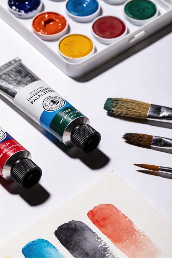
Here’s the trick: applying multiple thin layers of paint lets the light shine through without making the painting feel heavy. Think of it like building up frosting on a cake—each layer adds to the overall lightness. And don’t forget to let your brushstrokes show! They can add an interesting texture that draws people in.
The best part is that when you combine all these techniques, you’ll end up with a composition that feels lively and engaging. So, try these methods out and see how they work for you. Remember, it’s all about capturing that playful essence of high key painting. What techniques have you tried that worked for you? Using tools with ergonomic design features can also help maintain precision and comfort during detailed work like high key painting.
Recommended Products

Table Dimensions: 59Lx37Wx29H. Extended Length: 79. Armchair Dimensions: 23Lx25Wx35H. Armchair Seat Dimensions: 18.5Dx23.5Wx16.5H. Bench Dimensions: 48Lx26Wx35H. Bench Seat Dimensions: 18.5Dx42Wx16.5H.

Table Dimensions: 59Lx37Wx29H. Extended Length: 79. Side chair Dimensions: 18Lx20Wx35H. Side chair Seat Dimensions: 15Dx16Wx18H.

[9-PIECE SET]: This set includes 8 high quality virgin white resin buckets and teak finish legs and 1 teak finish table in a brown color. This set is ideal for both indoors and patio and will make your outdoors an elegant space to enjoy with family and friends.
How Do High Key and Low Key Photography Differ?
High key and low key photography are two styles that can really change how your photos look and feel. High key photography is all about bright tones and minimal shadows, which gives images a light, airy feel. On the other hand, low key photography focuses on dark tones, using shadows and contrasts to create a more dramatic and moody vibe.
So, how do you even get these looks? For high key shots, you’ll want to use multiple light sources to keep everything evenly lit. This way, you can avoid harsh shadows and keep the highlights bright. In contrast, low key photography often relies on a single light source. This setup allows you to play up the drama and really bring out those deep shadows.
Analyzing histograms can also help you grasp these differences. High key images typically hang out on the right side of the tonal range, showing off their lighter shades. If you check out low key images, they’ll cluster on the left, showcasing the darker tones. Understanding this can be a real boost for improving your photography skills.
To further enhance your creative process, consider the impact of using an ergonomic design, as it can reduce strain and improve comfort during long photo editing or painting sessions.
Want to get started? Try experimenting with both styles next time you’re out shooting. Frankly, it can be eye-opening to see what a difference lighting can make. So, what are you waiting for? Dive in and explore the unique vibes that high key and low key photography can create!
Recommended Products

SUPERIOR COLOR ACCURACY - With a CRI of 96 and TLCI of 97, the F800R ensures your colors are rendered faithfully, providing natural and vibrant results for professional photography and videography.

Portable 400Ws strobes with removable AC/DC batteries provide 550+ full-power flashes per charge

TRUE PARABOLIC STRUCTURE: This item has a true parabolic structure design, and the reflector is made of highly reflective inner silver mesh cloth, making reflected light combines smooth spread, beauty contrast and variable focus.
Practical Strategies for Mastering Value Ranges in High Key and Low Key Art
Have you ever struggled with capturing the right light and shadow in your art? When it comes to mastering value ranges in high key and low key artworks, understanding the value scale is crucial. In high key painting, stick to values 6 to 10. These lighter tones create a bright and harmonious palette, kind of how Claude Monet often approached his work. On the flip side, low key art dives into values below the midpoint, using darker tones that really bring out contrasts and shadows.
To sharpen your skills with different values, try this: practice capturing five distinct values from dark to light. This exercise helps you work within high and low key boundaries, allowing you to express lightness or darkness more effectively. So, why does this matter? Using atmospheric perspective, where you place lighter values in the background and darker hues in the foreground, can significantly boost the depth and realism of your pieces.
The best part is, playing around with these techniques can be a lot of fun. If you’re looking to enhance your compositions, experiment with different value ranges. It’s a great way to see how light interacts with color in your art. Also, combining your paintings with heavy body acrylic mediums can add texture and visual interest, enhancing the value effects you create.
Recommended Products

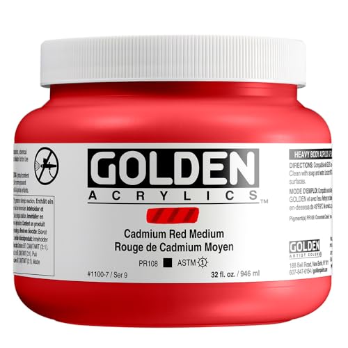
Cadmium Red Medium became the most widely used red shortly after it was synthesized in 1907 because it offered greater permanence and intensity than the mostly plant-based reds used up to that time
Frequently Asked Questions
What Is the Difference Between High-Key and Low Key Value?
High key lighting uses lighter tones for a bright, airy feel and minimal tonal contrast, while low key lighting emphasizes darkness, creating dramatic emotional impact and intense subject focus through effective photography techniques and color saturation.
What Is the 70/30 Rule in Art?
In our art composition, the 70/30 rule guides us, balancing 70% dominance with strong lighting effects and emotional impact, while the remaining 30% employs contrast techniques to enhance color theory and create enchanting visual storytelling.
What Is a Low Key Value Range?
A low key value range employs low key lighting, creating an emotional impact and visual mood through a limited color palette. It emphasizes contrast, enhancing artistic expression in both photographic techniques and cinematic styles.
What’s the Difference Between Low Key and High-Key?
High key and low key differ in emotional impact and visual contrast, influencing mood setting. We use lighting effects and color palettes to create striking photography styles, showcasing distinct artistic techniques that resonate deeply with our audience.


