As an Amazon Associate, we earn from qualifying purchases. Some links on this site are affiliate links at no extra cost to you. Our recommendations are based on thorough research and editorial judgment.
Creating Atmospheric Perspective Through Color Temperature
To create atmospheric perspective, we should use color temperature effectively. Cool hues, like light blues and grays, work well for distant elements, making them appear less vibrant. For example, when painting mountains, we shift from warm colors in the foreground to cooler tones in the background. This technique softens edges and enhances depth. Let’s also consider the time of day, as it affects light and color. With practice, we can master these skills and improve our artwork.
Key Takeaways
- Utilize cooler, desaturated hues for background elements to mimic the effects of atmospheric perspective caused by distance and light scattering.
- Gradually transition from warm, vibrant colors in the foreground to muted, cooler tones in the background to enhance depth perception.
- Apply gentle scumbling techniques to create soft edges and gradual color transitions, avoiding harsh tone changes for a more atmospheric effect.
- Consider lighting conditions, as morning light can appear warm while evening light takes on cooler tones, impacting color representation in your artwork.
- Invest in quality tools, such as fine watercolor brushes, to achieve smooth gradients and effectively depict atmospheric perspective in your paintings.
Understanding Color Temperature in Atmospheric Perspective
You may be interested


Ever notice how mountains in the distance seem to fade into cooler, bluer hues? This is all about color temperature, a neat little trick of the atmosphere that can really help you when you’re painting or just admiring a view.
As the eye travels toward the horizon, colors lose their vibrancy. Frankly, it’s not your imagination—those distant objects actually appear gray and lighter compared to the bright colors in the foreground. This happens because of Rayleigh scattering, where shorter blue wavelengths scatter more than warmer tones. And if it’s humid or polluted out, expect those blues to be even more pronounced. So, why does this matter? Understanding these shifts can help you convey depth in your artwork.
Here’s the trick: when you’re working on your paintings, think about how to mimic these color changes. Start with warm, saturated colors at the front and gradually transition to cooler, lighter tones as you move back. This will give your art a real sense of space. You can even look at photos or real-life scenes to see how colors change—it’s a fun way to enhance your skills.
The best part is, you can experiment with different techniques to see what works for you. Try layering your colors strategically or even playing around with glazes to enhance those atmospheric effects. Remember, every brushstroke is an opportunity to improve your representation of the natural world!
In short, color temperature is an essential tool for any artist or observer. Using an appropriate acrylic gesso primer can help prepare your surfaces for the best paint adhesion and color vibrancy. So next time you’re out taking in a view, think about how the colors change across the distance. What will you create inspired by that perspective?
The Role of Distance in Affecting Paint Color and Saturation

Ever notice how those distant hills seem to blend into a soft, muted color? It’s not just your imagination; as things get further away, they tend to lose their punch. This effect happens because of distance and how the atmosphere scatters light, often giving those backgrounds a cool blue tint. Objects that are far away look cooler and less vibrant, their colors fading into lighter, grayer tones. This can make the scene feel more layered and add a sense of depth.
If you’re painting what’s far off, keep in mind how colors change. Opt for softer blues and lighter shades for those background elements. You want to give the impression that they’re fading into the distance, rather than competing with what’s up close. Here’s the trick: as you add distance to your artwork, gradually de-saturate your colors. This will help diminish the contrast and create that atmospheric perspective we often see.
Also, think about how the time of day can shift the colors you perceive. Morning light can be warm and golden, while midday brings out bright clarity, and evening often washes over everything with cooler tones. So, why does this matter? It’s all about creating that true-to-life feel in your art.
Incorporating these aspects will really bring your pieces to life. Just remember to pay attention to those subtle changes in color and saturation. Creating a sense of distance can make all the difference in your artwork. What colors do you think you’ll experiment with next time?
Using watercolor paper with cold-pressed texture can enhance the visual depth and layering effects needed for this technique.
Practical Techniques for Applying Cool Hues to Enhance Depth

Creating depth in your artwork can feel like a challenge at times, right? One great way to achieve that is by playing with cool hues. By lightening and neutralizing the colors of objects that are further away, you can mimic how our eyes perceive distance. Think about using softer, less vibrant colors like blues and grays for those distant elements, as opposed to the bold colors you’d use in the foreground.
Here’s a tip that works wonders: try applying thin, transparent washes of those cool hues. This method creates a seamless transition between the foreground and the background, which really enhances that sense of depth. It’s a simple trick that can make your work pop!
Don’t forget about using stronger value contrasts in the foreground. This really helps to establish clear spatial relationships in your piece. Also, consider the time of day when you’re choosing your colors. How does the light look at dawn compared to dusk? Matching your colors to reflect atmospheric perspective can add a lifelike quality to your paintings.
For artists working outdoors or on the move, choosing portable watercolor pans with compact designs can make applying these techniques more convenient and efficient.
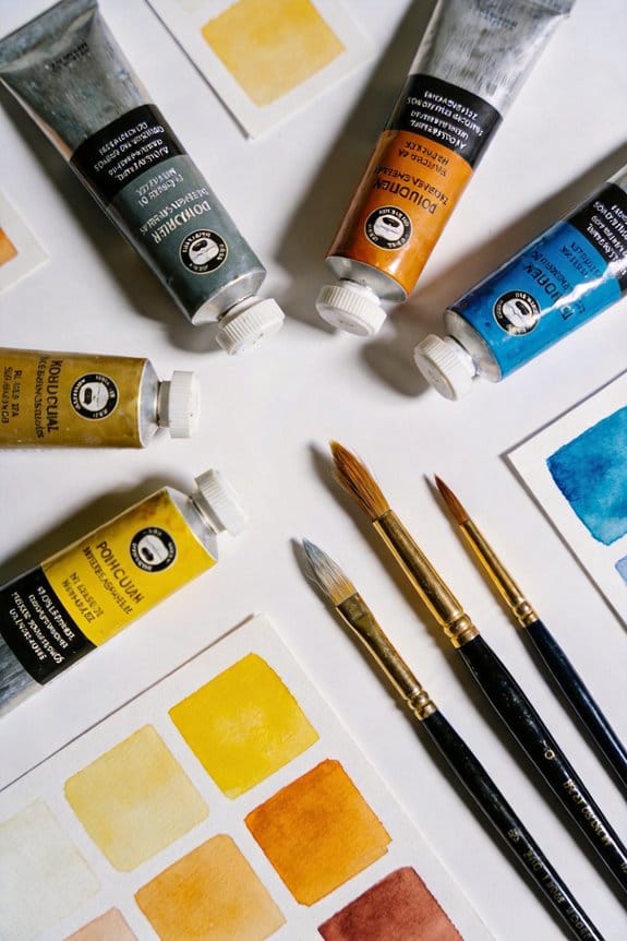
Recommended Products

🎨 THE BRAND: Schmincke has been producing the best, finest artists' colors Made in Germany since 1881 and they are available in over 60 countries. The range includes watercolors, acrylics, oil colors, pastels, gouache colors, airbrush colors and much more.

Includes 24 whole pans of artist's water colour

Includes: 24 watercolors (284650009 Buff Titanium/284650041 Hansa Yellow Light/284650238 Quinacridone Gold/284650040 Hansa Yellow Deep/284650085 Pillol Scarlet/28465 Permanent ants Zarin Crimson/284650092 Quinacridone Rose/284650106 Ultramarine Blue/284650021 Cerulean Blue Chromium/284650077 Phthalo Blue (Green Shade)/284650078 (blue shade)/2 84650102 SUPP GREEN/284650194 PERGREEN/284650109 UNDERSEA GREEN/284650233 ROCHENNALITE/284650114 YELLOW OCHER/28465014 GASITE BROWN OCHER Indian red/284 650086 Quinacridon Burnt Orange/284650010 Burnt Sienna / 284650011 Burnt Amber/284650097 Low Amber/284650239 Janes Grey, 24 Empty Containers for Watercolor Paint, 2 Metal Box
How to Gradually Blend Tones for Atmospheric Perspective?
Have you ever looked at a painting and wondered how the artist created that sense of depth? Achieving atmospheric perspective can seem tricky, but blending tones gradually is the key to making your artwork pop.
Try starting with thin, transparent washes to create smooth transitions, especially for those objects in the distance. You’ll notice that using cooler colors makes those elements feel further away, while warmer tones bring things closer to the foreground. One effective technique is to gently scumble colors on top of each other, layering them lightly. This approach softens the edges and allows a natural progression from light to dark, which ultimately enhances the depth of your piece.
Here’s the trick: avoid abrupt changes in tone. Instead, work with gradual gradations to mimic what you see in real life. So, why does this matter? Because those subtle transitions can make or break the atmospheric effect you’re going for.
Practice these blending techniques in different lighting — whether it’s bright sunshine or a moody overcast day. This will help you grasp how colors interact under various conditions. Honestly, with some patience and experimentation, you’ll see a noticeable improvement in your atmospheric perspective.
In the end, taking the time to blend your tones thoughtfully can elevate your art. Using acrylic gel mediums with different finishes can further enhance texture and blending possibilities in your paintings.
Are you ready to give it a try?
Recommended Products

Chrome vinyl wrap is the fast, cost-effective alternative to the expense of a new paint job.

This premium automotive vinyl is specially engineered for DIY'ers. This durable film is provides a lightweight, economical alternative to paint.

ULTRA-SLIM & SLEEK WHITE DESIGN: Standing at only 9 cm (3.5 inches) tall, the ÜLKA Premium features a professional White finish that blends seamlessly into any modern salon decor. Its low-profile design provides maximum legroom for both the technician and the client.
Using Color Contrast and Edge Techniques for Depth
Creating depth in a painting can sometimes feel like a real challenge, right? One way to tackle this is by combining color contrast with edge techniques. When you want those foreground elements to really pop, think about using warm, saturated colors. In contrast, for the objects that are meant to appear farther away, try incorporating cooler tones. This not only enhances the look but also helps simulate that atmospheric effect that makes items recede naturally into the background.
Here’s the trick: for maximum depth, consider using softer edges in your background. A little gentle blending can work wonders, making details less defined and allowing your sharper, more detailed foreground to take center stage. By mixing varying color temperatures—like blue and gray tones for those distant elements—you can reinforce that illusion of depth even further. As you shift from the foreground to the background, reducing the color intensity and contrast can help create those believable spatial relationships that draw the viewer in.
So, why does this matter? It’s all about guiding the viewer’s eye through your painting’s enchanting depth. Try implementing these edge techniques in your next piece—you might just find that you create a more engaging experience for anyone who views your work.
Truth is, understanding these concepts can really elevate your painting game. Using the right tools, such as watercolor brushes made from real squirrel hair, can greatly improve your ability to blend colors and create smooth gradients for atmospheric perspective. What techniques have you found effective in creating depth?
Recommended Products
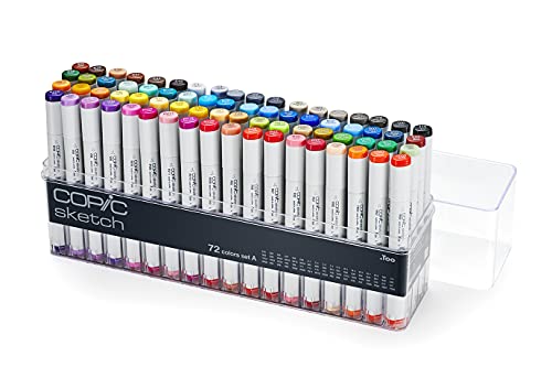
This 72A color set includes a broad range of bright colors, cool and warm grays, as well as 100 & 110 black. All of these colors blend well together. This is a great way to get started with Copic.

COMPLETE PROFESSIONAL WORKSTATION: The ultimate "Business in a Box" for MUAs. Includes 24 x 32g cakes, 2 massive 90g base colors, 5 large 50g split cakes, and 3 one-stroke cakes for infinite design possibilities. A trusted, global favourite for 15+ years.

WHAT IS IT: Faber Castell 167147 India ink PITT artist pen B studio box of 24
Frequently Asked Questions
How Does Color Temperature Contribute to Atmospheric Perspective?
Color temperature contributes to atmospheric perspective by using cool hues and fading tones to create depth perception. In landscape painting, we can achieve visual layering and emotional impact through thoughtful color gradients, reflecting our environment’s context and light intensity.
What Is the 70/30 Rule in Art?
The 70/30 rule in art emphasizes a 70/30 balance in color distribution. By using composition techniques, we create visual harmony and focal points, enhancing color dominance and visual impact while aligning with our unique artistic style and design principles.
How Do You Create Atmospheric Perspective?
To create atmospheric perspective, we use cool colors for distant objects, layering warm tones in the foreground. By manipulating contrast effects and light variation, we enhance depth perception and establish strong focal points within our visual hierarchy.
What Is the Atmospheric Perspective Color Theory?
Atmospheric perspective color theory emphasizes using warm colors in the foreground and cool colors in the background for depth perception. This technique enhances visual hierarchy, mood setting, and overall color harmony in landscape painting, enriching visual storytelling.


