As an Amazon Associate, we earn from qualifying purchases. Some links on this site are affiliate links at no extra cost to you. Our recommendations are based on thorough research and editorial judgment.
What Makes a Color “Muddy” and How to Avoid It
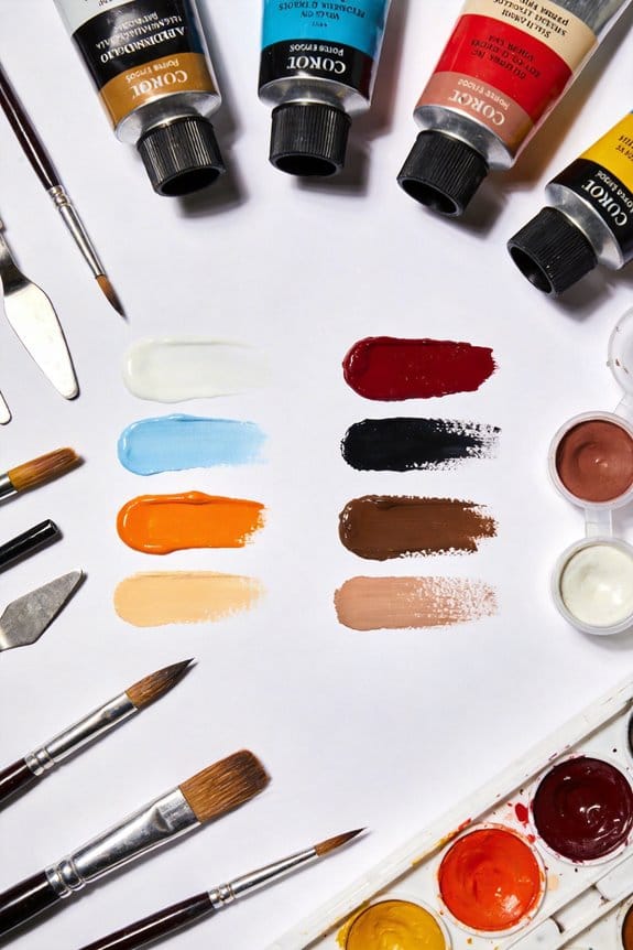
Muddy colors happen when we mix complementary paints, overblend them, or use too many colors together. To avoid this, stick to three pigments at a time. Clean your brushes thoroughly between colors, and choose similar warm or cool hues for blending. Using high-quality paints and keeping your palette organized can also help maintain vibrancy. Remember, fresh paint keeps colors bright. Let’s explore more techniques to keep our colors lively and vibrant!
Key Takeaways
- Mixing complementary colors produces dull greys and browns, contributing to muddy colors.
- Overmixing pigments and combining too many colors diminishes vibrancy and clarity.
- Use a limited palette of 3 to 6 colors to maintain control and prevent muddiness.
- Clean brushes thoroughly between color changes to avoid contamination from leftover paints.
- Stick to colors of similar temperature to enhance vibrancy and reduce the risk of muddiness.
Understanding Muddy Colors: Causes and Solutions
You may be interested

Ever wonder why your colors just don’t pop the way you want them to? Muddy colors can be such a frustrating issue when creating art. They usually happen when complementary colors get mixed together, leaving you with dull greys and browns instead of vibrant hues. So, how can you avoid this common pitfall and make your work shine?
Try this: limit yourself to mixing no more than three pigments at once. Seriously, overmixing is a sure way to lose that beautiful vibrancy you’re aiming for. And don’t forget about your brushes; clean them thoroughly between color changes. Residual paint can mess up your new mixtures in an instant.
It’s also crucial to pay attention to color temperature. Mixing warm tones with cool ones can dampen your results. Instead, focus on keeping those temperatures separate to maintain clarity in your palette.
To ensure brighter outcomes, stick to quality, single pigment paints. Honestly, they make a world of difference. You’ll find you can mix vibrant colors without the worry of them turning muddy.
Using an acrylic flow medium can also help maintain color brightness by improving paint flow and reducing mixing inconsistencies.
Recommended Products

· Premium Medium Grain Linen Canvas – Ready to Paint, No Prep Needed Triple-primed for immediate use with oil, acrylic, gouache, tempera, and more. Built for serious artists, studios, schools, and paint events. No warping, no curling — just clean, strong performance.

Bring Your Creative Vision to Life: Transform your world with Turbo Dork Acrylic Paints—designed to add vibrant, eye-catching colors to your projects. Choose from 40 single-color metallics and 40 color-shifting paints that shimmer and change in the light.

Professional Master Performance Acrylic Paint Airbrushing System with an Iwata Brand Model HP-CS Eclipse Dual-Action Gravity Feed Airbrush Set along with a U.S. Art Supply Water-Based Acrylic Airbrush Paint Kit with 12 Popular Primary Opaque Colors in 1 oz. Bottles plus Reducer and Cleaner.
Best Mixing Techniques to Avoid Muddy Colors

Are you tired of mixing colors only to end up with muddy, uninspiring results? It’s a common struggle for many artists, but there are some straightforward techniques that can really make a difference.
First off, try limiting your mixing to three pigments at a time. Going overboard can lead to a diluted mess instead of the vibrant colors you want. Also, don’t forget to clean your brushes thoroughly in between uses. Even a little leftover pigment can ruin your mix.
Here’s a quick tip: stick to similar temperature colors. For instance, when blending, it’s generally better to combine warm colors with warm ones. Whenever possible, opt for single pigment paints. They’ve got that clarity and consistency that mixed pigments often lack.
And for those who want to keep things simple, consider using a limited palette of just 3 to 6 colors. This not only streamlines your mixing process but also gives you greater control over the vibrancy of your artwork.
Honestly, the difference these techniques can make is significant. Think about it: why waste time wrestling with muddy hues when you could achieve beautiful results with a few deliberate choices? By keeping your mixing methods straightforward, you’ll enjoy a more colorful palette. Additionally, choosing paints with high pigmentation ensures better coverage and more vibrant mixes.
Recommended Products

BOX OF 100 colours & 1 full and 1 pencil blender, also available in 100 individual colours as well as boxes of 20, 40, 76 and as a Wooden presentation box of 76

HIGH-QUALITY MATERIALS - Our craftsmen utilize high-quality canvas and wood frames. Each print is produced with a state-of-the-art giclee printing process, ensuring a pristine finished product.

🖌️ PAINTS INCLUDED IN WARGAMERS - The 102 paints in the Wargamers Paint Set have been carefully selected of the fan-favourite Fanatic paints. With the 86 brilliant acrylic colours, 6 shining Metallics, 4 Washes, and 6 cool Effects, you can paint everything from a fire-breathing dragon and nobles in regal cloaks to Orcish warriors and alien creatures. There has also been included a basecoating brush and a Wargamer: Character Brush.
Choose Quality Materials for Vibrant Results

Want your artwork to truly shine? The materials you choose can make a huge difference. When you pick artist-grade paints, you’re getting pigments that are concentrated, leading to colors that really pop off the canvas. It’s worth spending a bit more on quality paints; the vibrancy you’ll see is totally worth it.
Opting for 100% cotton watercolor paper is another crucial step. This type of paper helps with the way your paint goes on and can prevent those annoying muddy colors from happening—not a fun problem to deal with! And let’s not forget the importance of using fresh paint. You want your colors to stay pure; old, dried-out paint can leave you with a dull palette, and no one wants that.
Here’s the trick: invest in good brushes. High-quality brushes let you control your colors better, so you’re less likely to accidentally mix colors together and create unwanted tones. A clean workspace shouldn’t be overlooked, either. Regularly cleaning your palettes and tools is key to avoiding color contamination. A little cleanup goes a long way in achieving those beautiful, saturated colors you dream of in your artwork.
Choosing non-toxic paints not only ensures safety but also helps maintain the longevity and purity of your colors.
In the end, remember that small changes in your materials can lead to big improvements in your work. What’s one quality material you’re thinking of trying next?
Recommended Products


Keep Your Palette Clean for Better Colors
A messy palette can really throw a wrench in your artistic flow, right? It’s frustrating when those colors get mixed up, turning your vibrant hues into a dull mess. Keeping your palette clean isn’t just a good habit; it’s crucial for achieving the bright, clear colors you want in your artwork.
Try this: make a habit of cleaning your palette regularly. This simple step helps prevent leftover paint from contaminating your new mixes. Flecks of dried paint or unintended color blends can dull the vibrancy you’re aiming for. Honestly, nobody wants to spend hours creating just to end up with muddy colors!
Another tip is to set aside specific sections on your palette for different pigments. This way, you can keep your colors organized and minimize the risk of accidental mixing. So, why does this really matter? Well, having a tidy space allows you to mix colors more deliberately and confidently. While seasoned artists might feel they can skip the cleaning now and then, those just starting out should really prioritize this practice.
The best part? A clean palette can seriously elevate your artwork and help it reflect your unique vision. Remember, it’s one of the first steps toward success in your creative journey. Have you ever tried cleaning your palette between color mixes? It might just change the way you paint! Using organizational features can improve how efficiently you keep your palette tidy and ready for use.
Recommended Products
All 80 original PanPastel colors

Outstanding Quality: Made of wear-resistant beech wood with varnish coating, the rolling storage cart is durable for long years to use. A solid wood frame provides the cart with stronger stability and excellent load-bearing capacity, meeting your daily needs.

Dutch-made Van Gogh oils have a buttery consistency with excellent tinting strength.
How Color Temperature Influences Your Mixing?
Have you ever mixed colors and ended up with a muddy mess instead of the bright, vibrant hues you envisioned? Trust me, you’re not alone in this. Understanding color temperature is key to getting it right. So, what is color temperature? It’s simply about how warm or cool a color feels.
Warm colors—think reds and yellows—tend to play nice together. Cool colors like blues and greens? They vibe well with their similar-toned buddies. When you mix these warm and cool colors, it can get tricky. You often end up dulling your artwork instead of enhancing it. That’s a frustration most artists know too well!
Here’s the trick: Before you jump into your painting, try using temperature swatches. This helps you visualize how colors will interact with one another. By doing this, you can manage your palette better, keeping your colors true and energetic as you work. It’s a simple step that can make a world of difference.
Frankly, if you want to avoid that dreaded muddiness in your artwork, pay attention to your color choices. Mixing wisely can keep that vibrancy alive. So, next time you paint, consider the temperature of your colors. Also, selecting high-quality pigments from professional-grade paints can enhance your color vibrancy and reduce muddiness.
Recommended Products

Art Gallery: The CanvasTV transforms any room into a curated gallery experience, displaying stunning artwork and photography when you're not watching. Choose from more than 1,000 complimentary curated works across styles and eras, or display your own photos and collections. Swap collections, rotate pieces and change the mood of any room. It's not just a TV. It's a piece of art.

Contemporary Classic Design: This high-ceiling chandelier is inspired by nature, with a silhouette that echoes the elegance of lush tree branches. Crafted from premium K9 crystal, its unique design makes it a stunning focal point—perfect for elevating any staircase or grand interior space.

Powerful 155W Dual Light & Super Large Illuminated - Honeywell 77.4'' standing lamp with double light source for optimal brightness. The 3376LM direct light, at a comfortable 4000K color temperature, provides natural and even illumination, thanks to micro-prism diffusers. Meanwhile, the 12624LM indirect light reflects off the ceiling to ensure consistent brightness throughout the room, minimizing eye strain and maintaining a pleasant ambiance. Whether for reading, working, or relaxing, this lamp creates the perfect lighting for any setting.
Frequently Asked Questions
What Makes a Color Muddy?
When colors clash like the opposing forces in a grand tale, muddiness arises from poor color mixing. We need to embrace color theory, ensuring harmony by carefully balancing warm and cool tones, avoiding excessive complementary blends.
How to Fix Muddy Shading?
To fix muddy shading, we’ll focus on careful color mixing and palette selection. Using light source considerations, let’s layer transparent colors over dried areas and apply shading techniques with complementary shades for effective gradient application.
How Do You Avoid Muddy Colors?
To avoid muddy colors, we limit our palette to three vibrant colors. For instance, mixing only warm pigments guarantees color harmony, utilizing color theory enhances balance, leading to clearer, more dynamic artwork that resonates with viewers.
What Is the 70/30 Rule in Art?
The 70/30 rule in art encourages us to use a dominant color, balancing it with complementary hues. By mixing warm and cool colors while considering saturation levels, we enhance our compositions with dynamic hue variations.


