As an Amazon Associate, we earn from qualifying purchases. Some links on this site are affiliate links at no extra cost to you. Our recommendations are based on thorough research and editorial judgment.


Anti-Aliasing: What It Is and How It Affects Line Art

Anti-aliasing is a technique that smooths jagged edges in line art, making it look more professional. It blends colors at the borders of objects, reducing blockiness and improving clarity. Without anti-aliasing, we often see sharp pixel shifts, which create unwanted artifacts like halos and jagged edges. For best results, we can use settings like AntiAlias mode in graphics software. By understanding these concepts, we can enhance our artwork markedly, and there’s more to explore on this topic.
Key Takeaways
- Anti-aliasing is a technique that smooths jagged edges in line art, improving visual appeal and quality.
- Its absence creates jagged edges, coloring halos, and potential printing artifacts in digital artwork.
- Techniques like smoothing mode settings and vector layers help achieve effective anti-aliasing results.
- Manual anti-aliasing allows for specific adjustments, while automatic methods prioritize efficiency in achieving smoothness.
- Best practices, including supersampling and avoiding anti-aliasing on straight lines, enhance overall artwork clarity and aesthetics.
Understanding Anti-Aliasing: Basics and Importance
You may be interested


Have you ever looked at a digital image and noticed those annoying jagged edges? You know the ones I’m talking about—the pixelated outlines that make everything look a bit choppy. That’s where anti-aliasing comes in. This technique works to smooth out those rough edges by blending the colors of pixels along the borders of objects.
So, what exactly causes this jaggedness? It often happens due to low-frequency sampling. In simpler terms, when the pixels don’t line up with the curves of an image, you get what looks like a staircase effect. Sounds frustrating, right?
To tackle this, there are methods like multisampling and supersampling. Here’s the trick: these techniques sample multiple points within each pixel and average the color values. This averaging makes the edges look way more blended and natural. It’s especially noticeable on high-resolution screens. When you’re gaming or looking at 3D art, anti-aliasing helps bring realism to life, making everything feel more polished.
Truth is, if you’re working with images, using anti-aliasing can really improve their overall look. It’s all about ensuring your visuals appeal to the eye and make your work stand out. So, next time you’re tweaking an image, consider how you can apply this technique to enhance its quality. Just like selecting the right brush size can affect the quality of traditional artwork, the right anti-aliasing technique influences digital image clarity.
In short, anti-aliasing smooths out the edges that can detract from your artwork’s appeal. Why not give it a shot and see how much better your visuals can look?
Common Visual Artifacts in Line Art Without Anti-Aliasing
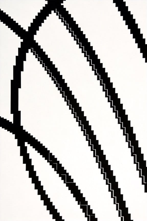
When you’re diving into line art without anti-aliasing, you might notice some frustrating visual artifacts that can really mess with your masterpiece. Ever dealt with jagged edges that make your smooth lines look more like stair steps? Those sharp pixel changes can create blockiness on modern screens that’s hard to ignore.
You might also run into something called coloring halos. These are those pesky borders that pop up when colors don’t mix well with aliased lines, making it tricky to fill areas without leaving some awkward gaps. And if you’re planning to print your work, be prepared for printing artifacts. Seeing lines that have thinned out or even disappeared completely can be disheartening, right?
Another thing to keep in mind is how resolution affects your work. With low-resolution art, that jaggedness you see can really impact the overall quality. So, why does this matter? The better you understand these common problems, the easier it’ll be to tackle them and create smoother-looking art.
To sum it up, navigating these challenges is all about awareness. If you keep an eye out for these artifacts, you’ll be better equipped to manage them and elevate your line art. Have you faced any of these issues while creating?
Using a drawing tablet with high pressure sensitivity can help artists achieve smoother lines and reduce the visual impact of these artifacts.
Exploring Effective Techniques for Anti-Aliasing in Line Art
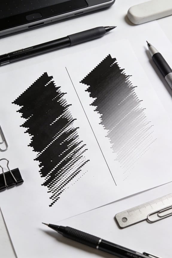
Creating smoother line art can feel like a big challenge, especially if you’re struggling with those jagged edges. So, what can you do to improve your lines? First off, setting the SmoothingMode to AntiAlias in your graphics software makes a noticeable difference. It really does wonders for curvier shapes and lines.
Using vector layers in Clip Studio Paint is another great option. It lets you scale your work without losing any quality. Try making short, confident strokes; they give you better control and make your lines look cleaner. Changing up your brush size from 12 to 5 pixels can also bring out more detail, which is super helpful.
Now, let’s talk about that anti-aliasing slider. Set it to medium to find a good balance between smoothness and avoiding pixelation. Be mindful about layer management, too. Enabling anti-aliasing at larger canvas sizes (like around 3000 pixels) is a smart move.
On the flip side, if you’re working with pixel art, turn off anti-aliasing to keep those colors sharp and true. Trust me, that can save you from unwanted hues and keep your art looking clean.
In short, these techniques can seriously elevate the quality of your line art. Using high-quality tools like Prismacolor Premier Fine Line Markers can also help translate your smooth digital lines into traditional media effectively. What are you waiting for? Give them a shot and notice the difference!
Manual vs. Automatic Anti-Aliasing: Which Is Better?
How do you choose between manual and automatic anti-aliasing? It can feel tricky when you’re caught up in design work, especially considering the different outcomes each method brings to the table.
Manual anti-aliasing lets you fine-tune everything. If you’re focused on typography in static images, it’s the way to go. You can adjust settings in Photoshop to achieve smooth letterforms, ensuring they look crisp and clear. This might take a little extra time, but the results are often worth the effort.
On the flip side, automatic anti-aliasing can be a lifesaver in performance-heavy situations. Ever tried FXAA? It does a decent job of reducing those jagged edges without putting too much strain on your system. If you want sharper results while still keeping efficiency in mind, SMAA is a solid choice. Then there’s MSAA, which shines in geometry-heavy scenes, producing sharp edges without that blurred look we all dread.
So, what’s the best approach for you? It really comes down to what you’re creating, the software at your disposal, and how much you’re willing to balance visual quality with system performance. Each method has its own strengths, and understanding these can help you make a more informed choice.
In the end, whether you go manual or automatic, think about your project’s needs and experiment with both options to see what works best for you. What will you try next? Remember, just as artists select markers based on tip variety and ink quality, the tools you choose for anti-aliasing depend on your desired outcome and workflow needs.
Best Practices for Anti-Aliasing in Graphics
Finding the right anti-aliasing method can be a bit of a headache, can’t it? The choice you make can really shape the visual quality of your graphics, and you don’t want to waste time on something that doesn’t deliver. For those seeking top-notch visuals, Supersampling Anti-Aliasing (SSAA) is worth considering. It works by rendering your graphics at a higher resolution before downsizing, which typically results in a cleaner image. Just keep in mind, it can hog a lot of resources.
If you’re after a good balance between quality and performance, go for Multisample Anti-Aliasing (MSAA). It’s particularly effective around edges, making it a favorite for many games.
Now, if speed is your priority, you might lean towards Fast Approximate Anti-Aliasing (FXAA). It’s quick and does a decent job overall, but be warned—it can introduce a slight blur to your images. Ever notice that fuzzy edge?
Want another option? Coverage Sample Anti-Aliasing (CSAA) builds on MSAA, boosting the blending quality without taking a heavy toll on performance. That’s a win-win if you ask me.
And here’s a little tip: it’s best to skip the anti-aliasing on straight lines, like the axes of graphs. It often doesn’t make a difference and can even lead to unwanted artifacts.
Understanding these various algorithms can really help you make smarter choices for each project while keeping an eye on performance. Also, just as selecting the right acrylic flow medium enhances paint flow and final artwork quality, choosing suitable anti-aliasing techniques impacts the smoothness and clarity of digital lines, much like the way viscosity adjustment affects acrylic paint application. So, what’s your go-to anti-aliasing method when you’re creating graphics?
How High-Resolution Displays Reduce Aliasing Effects
Have you ever noticed how jagged edges can ruin a beautiful image? If you’ve been struggling with those annoying aliasing effects, you might want to look into high-resolution displays. With screens boasting higher pixel densities, like 4K at 3840×2160, those sharp edges become a thing of the past. Diagonal lines and curves start to appear much smoother, which is something your eyes will definitely appreciate.
What’s the secret behind this clarity? It all comes down to those dense pixel arrays. They allow for intricate details to be represented accurately without any folding. Higher resolutions mean you might not even need the traditional anti-aliasing techniques most of the time. So, instead of putting all the heavy lifting on your GPU, you get to enjoy fewer jagged edges just naturally, without extra processing.
The best part is that high-DPI displays are fantastic for line art. They not only reduce that annoying color stair-stepping but also keep the finer details looking sharp and clear. If you love crisp visuals, a high-resolution display could be the way to go. Plus, tools like dual brush tips in digital art supplies can further enhance the smoothness and detail of line work.
Real-World Examples of Effective Anti-Aliasing in Art
Have you ever noticed how digital art just pops with color and clarity? One of the secrets behind those stunning visuals is anti-aliasing. It’s all about smoothing out those jagged edges to make everything look seamless. Take pixel art, for example. When you create an orange arc against a dark gray background, using careful pixel smoothing makes a huge difference. Adding in those intermediate colors helps keep the shape intact while blending the colors nicely.
When it comes to typography, anti-aliasing is a real lifesaver for readability. You might not even think about it, but those little gray pixels on the edges of curvy fonts do a lot to maintain clarity without looking harsh. If you’re working on character design, try using a couple of mid-tone pixels on hair strands. It gives the hair a more natural flow and helps your characters feel alive.
So, here’s the trick: it’s all about the details. Some people might overlook the importance of anti-aliasing, but it really adds that finishing touch to your artwork. The best part is, with just a little more attention to those edges and contours, you can create pieces that are not only vibrant but also sharp and defined.
In fact, choosing the right tools like pens with various tip sizes can enhance line clarity and complement anti-aliasing effects in traditional art.
In the end, taking the time to master anti-aliasing techniques makes your art shine. Have you experimented with these ideas in your own work?
Frequently Asked Questions
How Does Anti-Aliasing Impact Image File Size?
Anti-aliasing impacts image file size by increasing pixel density and complexity, leading to larger files. Even with file compression, resolution changes can exacerbate size growth, impacting storage and processing requirements in our projects.
Can Anti-Aliasing Create Unexpected Color Changes?
Yes, anti-aliasing can create unexpected color changes. By blending colors for smoother edges, it can alter our visual perception, leading to variations that might not be present in the original artwork. We should carefully manage these effects.
Does Anti-Aliasing Affect Print Quality of Digital Art?
Absolutely, anti-aliasing doesn’t greatly affect print quality at high print resolutions. We find that color accuracy often remains intact, ensuring our artwork looks great, whether it’s aliased or anti-aliased during the creation process.
Is Real-Time Anti-Aliasing Necessary in Animations?
While some might think real-time anti-aliasing isn’t essential, we believe it greatly enhances animation clarity. Its impact on real-time performance allows smoother visuals, reducing visual artifacts and improving overall viewer experience in dynamic scenes.
What Tools Offer the Best Anti-Aliasing Features?
For digital painting and vector graphics, tools like Clip Studio Paint and Krita offer excellent anti-aliasing features. They enhance our line work while minimizing issues with fills and maintaining clarity in our artwork.


