As an Amazon Associate, we earn from qualifying purchases. Some links on this site are affiliate links at no extra cost to you. Our recommendations are based on thorough research and editorial judgment.
Tinting Strength: Which Pigments Dominate a Mix?
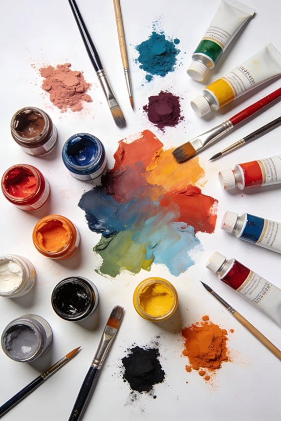
When we mix colors, it’s crucial to know which pigments are dominant or recessive. Dominant pigments like Thalo Blue and Alizarin Crimson pack a punch even in small amounts. In contrast, recessive pigments, such as yellow, require more—for instance, two-thirds more yellow than red to create a balanced orange. By understanding these differences, we can enhance our color mixing skills. Let’s also explore how techniques and particle sizes impact our mixes for even better results.
Key Takeaways
- Dominant pigments, like Thalo Blue and Alizarin Crimson, require less quantity to create significant color impact in mixtures.
- Recessive pigments, such as yellow, need larger amounts to maintain color vibrancy and balance in mixes.
- Mixing dominant and recessive pigments enhances brightness and overall vibrancy in color combinations.
- High pigmentation in acrylic paints improves color coverage, saturation, and leads to better mixing quality.
- Particle size affects tinting strength, with smaller particles providing higher strength and opacity for achieving desired colors more efficiently.
What Is Tinting Strength and Why Does It Matter?
You may be interested


Have you ever mixed colors only to find that they didn’t turn out the way you hoped? It can be frustrating, right? Understanding tinting strength can make a big difference in your color mixing results. So, what exactly is tinting strength? Simply put, it’s about how much a pigment affects the intensity of the color mixtures based on how much you use.
Take Thalo Blue, for example. It has a much higher tinting strength compared to yellow pigments. This means you’ll need to add a lot more yellow—about two-thirds more—to achieve a vibrant orange when mixing with red. Isn’t that crazy? Dominant pigments like Thalo Blue pack a punch with just a small amount, while recessive pigments can easily wash out your mixtures and dull the color.
Here’s the trick: you can use this knowledge to brighten your creations. By mixing in dominant colors with the recessive ones, you can really amp up the vibrancy. This isn’t just about aesthetics, though—understanding tinting strength can help save you materials and time while you work on your art.
Honestly, knowing how to play with these strengths can transform your color palette. So next time you’re at your easel, pay attention to how much of each pigment you’re adding. Check the impact it has on the final mix. By keeping an eye on this, you’ll not only enhance your work but also gain confidence in your color choices. It’s also important to consider the consistency and texture of your paints, as it influences how pigments blend and retain vibrancy on canvas.
Spotting the Strongest Pigments for Mixing Colors

How do you figure out which pigments pack the most punch for mixing colors? First off, think about tinting strength. This tells you how much pigment you need to change a mix. For example, Thalo Blue is seriously strong; just a tiny bit goes a long way compared to other colors.
When mixing, dominant pigments like Alizarin Crimson can really take over, especially when you throw in recessive colors like Viridian Green. This is super important because mixing dominant and recessive colors usually leads to cleaner, brighter mixtures. Ever noticed how yellow, which has the least tinting strength, needs a lot more added to create a vibrant orange from red? Understanding these little details is key to making your colors pop.
So how do you start applying this?
- Experiment with Thalo Blue in small amounts.
- Keep dominant colors in mind; they can overpower a mix.
- Don’t forget about the recessive ones; use them wisely for balance.
Truth is, the right knowledge can save you a lot of trial and error in achieving lively color combinations. What pigments have you been mixing lately? Also, choosing acrylic paints with high pigmentation can ensure your mixtures have excellent coverage and saturation.
Recommended Products

PAINT + PRIMER: KILZ TRIBUTE is a low VOC, 100% acrylic advanced technology paint and primer in one formulated for superior hide and coverage with exceptional durability. Paint and primer covers light-medium stains and light-dark color changes.

The extra power allows for less thinning of viscous paints and achieves finer atomization5-Stage Turbine produces 9 5psi featuring Variable Speed Control Dial allows user to adjust motor speed

5-Stage turbine produces 9.5Psi
How Do Colors Influence Tinting Strength?

Have you ever mixed paints and wondered why some colors turn out muddy while others pop? The truth is, the hues you choose can really change the strength of your pigments. For example, yellows often have less tinting strength compared to colors like blue or red. Take Thalo Blue, for instance; it has quite a punch and usually needs ten times less pigment to make a similar visual impact as weaker colors.
When you mix a strong pigment, like Thalo Blue, with a weaker one, such as yellow, you end up with a cleaner and more vibrant mixture. Plus, consider the particle size of your pigments. Larger particles sometimes reduce hiding power, which can throw a wrench in your plans for that perfect color blend.
So, why does this matter? Well, understanding how colors work together is key to better mixing. It can help you avoid that frustrating muddiness and achieve the precise results you’re after in your artwork.
Here’s a tip: when you’re experimenting, keep track of your mixtures and what works. You’ll soon find a system that brings out the best in your colors. Remember, it’s all about knowing how these relationships play out, leading to more engaging and effective artwork. What’s your go-to trick for brightening up your pigments? Using the right brush size selection can also influence how vividly your mixed colors appear on canvas.
Recommended Products
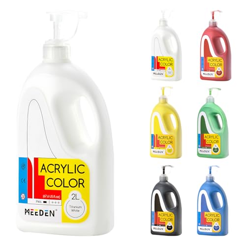
QUALITY MATERIALS: The MEEDEN acrylic paints are made of high-quality pigments and can provide a creamy, fluent, and finesse texture, just as high-end paints perform with better coverage and mixability.

Each color swatch has been tested for masstone, mixability, lightfastness, drying properties, pigment dispersion and viscosity
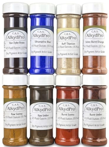
Multi-medium compatibility:dry pigment intended for mixing with oil, water-based, or acrylic binders. use and performance depend on formulation and processing.
Essential Techniques for Mixing High vs. Low Tinting Strength Pigments
Mixing pigments can feel tricky, especially when you’re juggling colors with different tinting strengths. If you’ve ever tried mixing Phthalo Blue with Cadmium Yellow, you know what I mean. High tinting strength pigments, like Phthalo Blue, need less of them to match the intensity of lower strengths. So how do you avoid muddy mixes and keep those colors vibrant?
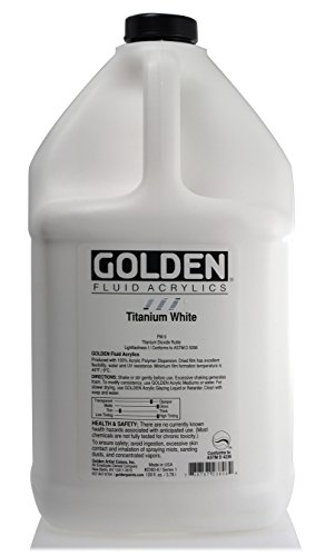
Instead of dumping your high strength pigments into the mix, it’s smarter to add them to the low strength ones. Take Quinacridone Red and Titanium White, for example. When you blend those two, the vibrancy really shines through. It’s all about knowing the properties of each pigment.
You might be wondering why this matters. Well, effective mixing means you can make precise adjustments without wasting paint. Keeping your mixes bright and true to the intended colors is what every artist aims for.
So remember:
- Start with lower strength pigments.
- Add the high strength gradually.
- Always keep an eye on vibrancy to ensure your colors sing.
In the end, mixing can be a fun experiment that helps you understand your materials even better. Have you tried mixing colors in this way before? What were your results? Using high-quality pigments can significantly improve your color mixing outcomes and final artwork appearance.
Recommended Products

Dutch-made Van Gogh oils have a buttery consistency with excellent tinting strength.

Introducing All the shades of Red Oil Paint offered by Gamblin in one specific Professional artist set.
The Impact of Particle Size on Tinting Strength
Have you ever wondered why some colors pop more than others when you’re mixing paints? The secret often lies in the size of the pigment particles. Here’s the trick: smaller pigment particles have a larger surface area, which helps them mix better with lighter colors and boosts their tinting strength.
Take titanium dioxide, for example. When its particles are less than 1 micron, they’re excellent at scattering light, making your colors brighter and clearer. On the flip side, if you’re working with coarse pigments that range from 45 to 75 microns, don’t expect them to provide the same vibrancy. They tend to deliver only moderate tinting strength.
To really take your color mixing to the next level, consider using extra-fine pigments that measure about 5 to 10 microns. Why? Because they offer the highest tinting strength and opacity, allowing you to have better control over color intensity. It’s all about understanding that particle size can impact how your colors come together in your artwork.
So, how can you apply this in your next project? When you’re striving for those clean mixes and vibrant compositions, remember that the right pigment size makes all the difference. Truth is, paying attention to these details can really elevate your art in a way that feels effortless.
In addition, choosing acrylic paints with high pigmentation ensures richer color payoff and better coverage for your mixes.
In short, if you want to ensure your colors turn out just right, don’t underestimate the power of pigment size. What are some color combinations you’ve been wanting to try?
Recommended Products

✅[DTF Printer VS DTG Printer]: DTF Printing Requires No Pre-treatment And DTF Printing Is More Durable. DTF Printers Transfer Designs To Garments Through Special Films. DTG Printers Work Best With Natural Fibers, While DTF Printers Can Print A Wider Range Of Materials. DTF Printers Typically Print Brighter Colors On Dark Fabrics.

✅[Stable Feeding & Smoother Printing]: A3 DTF printer with air suction to keep film flat, helping reduce wrinkles. Fast ink fixation supports film adhesion, while the optimized feed path helps lower paper jam risk for stable output.

Upgraded L8058 DTF Printer - DXZ DTF printer features a white ink mixing system, and Semi-Automatic Cleaning System.Say goodbye to clogs and ensure smooth white ink flow for vibrant prints on light and dark fabrics.
Avoid These Common Mistakes With Tinting Strength
Have you ever mixed colors only to end up with a muddy mess instead of the vibrant shade you were hoping for? Understanding the tinting strength of pigments is key to avoiding common pitfalls in color mixing. It’s surprising how often we overlook the dominance of certain colors and how they can easily overpower more subtle hues.
For example, did you know that yellow has the least tinting strength? You’d need about two-thirds more yellow pigment than red to get a balanced orange. If you don’t consider these differences, your mixes may lack the pop you’re after and end up looking dull or gray instead. So, why does this matter? It can make or break your artwork!
Here’s the trick: when using pigments like Phthalo Blue, you’ll notice that you can use much less of it compared to others because of its smaller particle size. This means that just a tiny bit goes a long way. When you start paying attention to these details, you can create shades that are much more in line with your vision and color scheme.
Keep these principles in mind when you’re blending colors, and you’ll likely see improvements in your color mixes. Remember, recognizing the tinting strength helps ensure that the shades you create not only look great but also maintain a sense of balance.
Recommended Products

Professional Grade Acrylic Paint: This acrylic paint is highly pigmented w/ pure, genuine pigments

Primed Stretched Canvas Bulk: you will receive 3 pieces of blank canvases for painting in the package, Our 48x36" are stretched & stapled firmly to the pinewood frame. 5/8 inch thick, which is famous for sturdy but also resilient, effectively to protect your painting from wet, deform or crack during the changing seasons. watercolor canvases are easy to hang on the wall.

Microblading Ink Set - This contains four of our most popular cosmetic tattoo ink pigments in the shades Dark Forest, Dark Fudge, Blackish Brown, and Blazing Copper Modifier. Used for tattoo makeup application.
Mastering Color Harmony While Mixing Pigments
Mixing pigments can be tricky, right? If you’ve ever struggled to get that perfect shade, you’re not alone. Mastering color harmony is key to getting those vibrant results in your artwork. Start with the dominant pigment, think Titanium White or Phthalo Blue—these guys can easily take over the mix, and that’s okay! It helps keep your colors lively and engaging.
When you get down to mixing, be mindful of your ratios. For example, if you’re trying to make orange, you’ll need to add about 2/3 more Yellow than Red to reach that sweet spot of equal intensity. And don’t forget about the undertones of your pigments. Do you have a blue that leans more toward green? That’ll give you a completely different hue compared to one with a purple bias. So, why does this even matter? Because those small shifts in ratio make a big difference in how your final color works in your piece.
Here’s a quick tip: Keep a journal of your mixes. Jot down what you did, how it turned out, and any changes you’d make next time. It’s a simple way to track your progress and figure out what works best for you.
To wrap it up, mastering color harmony is all about experimentation and paying attention to the details. Have you tried adjusting your mixes based on undertones before? It could be just what you need to elevate your artwork to the next level! Using acrylic flow mediums can also enhance the fluidity and vibrancy of your color mixes, giving your artwork a professional finish with reduced brush marks and improved blending acrylic flow mediums.
Frequently Asked Questions
How Do Different Mediums Affect Tinting Strength in Pigments?
Different mediums affect tinting strength through medium viscosity, binder type, and solvent effects. We can explore layering techniques and color mixing to enhance paint formulation, achieving the desired intensity and depth in our artwork.
Can Tinting Strength Change With Drying Time or Conditions?
Yes, tinting strength can change with drying time and conditions. We’ve noticed that humidity effects, temperature variations, and surface preparation all play roles in pigment saturation, altering results as drying times progress.
Are There Any Non-Pigment Factors Influencing Tinting Strength?
Yes, non-pigment factors influence tinting strength. Binder composition, particle size, mixing technique, temperature effects, dilution ratio, and application method shape our colors, ensuring we achieve the desired vibrancy and depth in our creations.
What Role Does Opacity Play in Tinting Strength Determination?
Opacity levels greatly influence color depth and transparency ratios in our mixes. By considering surface textures and using various mixing techniques, we can enhance visual perception, resulting in richer and more dynamic color experiences.
How Can I Test the Tinting Strength of My Pigments?
To test our pigments’ tinting strength, we’ll conduct tinting experiments, perform a pigment comparison, adjust mixing ratios, examine color dilution, check pigment stability, and finally, make visual evaluations to see which ones shine brightest!


