As an Amazon Associate, we earn from qualifying purchases. Some links on this site are affiliate links at no extra cost to you. Our recommendations are based on thorough research and editorial judgment.


RGB vs. CMYK: Preparing Art for Screen vs. Print

When we prepare art for screen and print, understanding RGB and CMYK is key. RGB, which stands for Red, Green, and Blue, is best for digital work because it creates bright colors through light. CMYK, or Cyan, Magenta, Yellow, and Black, is for printing. It uses inks, often resulting in duller colors. Converting from RGB to CMYK can lead to color loss, especially with vivid hues. Let’s explore how to guarantee color accuracy and the right formats for our designs.
Key Takeaways
- Design in RGB for vibrant digital displays, as it supports a wider color gamut and offers brighter hues for screens.
- Convert to CMYK for print to ensure colors accurately reflect printed outputs, being mindful of potential dullness, especially in specific color ranges.
- Set appropriate color profiles at the project’s start, using RGB for digital and CMYK for print to prevent inconsistencies.
- Choose suitable file formats: use JPEG/PNG for RGB designs and PDFs for CMYK print materials to maintain color fidelity.
- Test print proofs to verify color accuracy before final production, helping ensure the printed version matches your digital design intentions.
What Is RGB and Why Is It Important for Digital Art?
You may be interested



Have you ever wondered why your artwork doesn’t look the same on different screens? That’s where RGB comes in. RGB stands for Red, Green, and Blue, and it’s the primary color model that screens use to display images. This model creates millions of colors by mixing light, which can give your digital art some seriously vibrant hues.
When you design in RGB, you’re able to capture colors that are actually true to life. This is especially helpful if you’re working on fine art prints using high-quality inkjet printers. Keeping color accuracy in mind is essential, and that’s why most digital applications rely on the sRGB format. It’s like a safety net; it ensures your work remains consistent across various devices.
Want to avoid those pesky color conversion issues later on? Start your projects in RGB from the very beginning. This way, your artwork can keep its integrity when you’re transferring it from screen to print.
Honestly, mastering RGB can make a huge difference in the final output of your artwork. The best part is that it allows for a wider color gamut compared to other color models. So, have you tried working with RGB in your projects yet? It’s definitely worth exploring for creating those bright and bold works of art.
Flow mediums with clear, glossy finishes can help preserve the vibrancy of your acrylic prints when translating RGB colors into physical form using paints or mediums like Professional Gloss Pouring Medium.
In short, RGB can elevate your digital art game and keep it looking consistent across different platforms. Have you thought about your color choices and how they affect your overall design?
Understanding RGB vs CMYK: The Color Models for Digital and Print
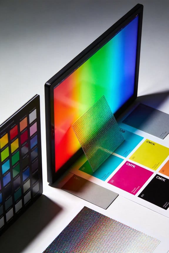
Understanding the differences between RGB and CMYK is crucial for anyone diving into graphic design. Have you ever printed something out, only to be disappointed by how dull the colors look compared to what you saw on your screen? That’s where knowing these two color models can really make a difference.
So, let’s break it down: RGB stands for Red, Green, and Blue. This model is all about light and is used for digital displays. With RGB, you can mix these colors in different intensities, resulting in over 16.7 million options. On the flip side, there’s CMYK, which stands for Cyan, Magenta, Yellow, and Black. This model relies on ink and is typically used in printing, but it has a more limited color range because of the way inks blend on paper.
When you convert your vibrant RGB designs to CMYK, you might notice some colors, especially reds and purples, lose their pop. It can be a real letdown, right? To dodge those pitfalls, it’s smart to keep your audience in mind and design within the capabilities of your final product.
Here’s the trick: use RGB when working on digital art. This will ensure the colors are as bright and true as possible on-screen. But if you’re gearing up for print, it’s best to start thinking in CMYK before diving into the design process. That way, you’ll have more control over how your final piece turns out. Also, understanding how color mixing behaves differently in various mediums can help bridge the gap between screen and print outputs.
In short, knowing when to use RGB and CMYK can keep your artwork looking fantastic, whether it’s on a screen or in print. Have you encountered any surprises in your own design work when switching between these color models?
When to Convert From RGB to CMYK for Printing?
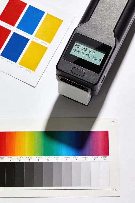
When you’re getting your artwork ready for print, knowing the right moment to switch from RGB to CMYK can make a huge difference. You usually want to do this after you’ve wrapped up your design in RGB. Why? Because RGB gives you a wider range of colors, which means your visuals can really pop before they’re dialed back for print.
But here’s the catch: when you convert RGB to CMYK, you might notice some colors turn a bit dull, especially those vibrant reds, purples, and oranges. So, how do you avoid those unexpected surprises? It’s all about understanding the specific settings your print service uses. Don’t forget to check their required color profiles before converting.
Try this: use software like Adobe Photoshop to preview how the colors will look in CMYK. This way, you can tweak things before sending them off for printing. It’s all about getting the ideal print quality while keeping those vibrant tones as close as possible to what you designed.
Honestly, navigating this process can be tricky, but it’s essential for achieving those bright prints you want. So, as you embark on your printing adventure, keep these tips in mind. What are some color choices you’re most excited to see in print? Also, just as important as color management is choosing the right cutting mat thickness to ensure clean cuts on your printed projects and maintain stability during crafting.
How RGB and CMYK Impact Color Representation
Have you ever tried to print something that looked amazing on your screen, only to find it came out dull and lifeless on paper? You’re not alone! Understanding how RGB and CMYK work can really help avoid these frustrations in your projects.
Let’s break it down. RGB stands for Red, Green, and Blue, and it’s all about light—think of it like mixing colors on your phone or computer. This model can create up to 16.7 million colors, and that means vibrant, eye-catching designs. On the flip side, there’s CMYK, which stands for Cyan, Magenta, Yellow, and Black. This one uses inks for printing, and honestly, it can sometimes lead to less vibrant colors, especially if you’re expecting neon-like shades.
So, here’s the trick: when you’re working on designs, start in RGB for that rich color, and then convert to CMYK before printing. That way, you’re more likely to get an accurate representation of what you want on the final print. However, be prepared for potential color shifts—those bright pinks or greens you love might not look the same once they hit paper.
Why does this matter? Because the difference can affect the overall quality of your work. You want your designs to shine, whether they’re on a screen or on a page, so taking this extra step can really pay off. Many artists rely on blendable, water-based ink in their tools to achieve vibrant colors that transition well between digital and print media.
To wrap it up, always begin your projects in RGB to enjoy the brightness, then switch to CMYK before printing to ensure your colors come through as accurately as possible. Have you had any experiences with unexpected color shifts?
Why Color Profiles Matter in Your Designs
Have you ever finished a design, only to find that the colors look totally different when you print it out? It’s super frustrating, right? That’s where color profiles come into play, and they can really make or break your project.
Understanding color profiles can help you ensure your designs look great across different devices. For digital displays, RGB is the way to go; it’s bright and vibrant. On the other hand, if you’re working on print materials, you’ll want to switch to CMYK. Each profile helps avoid those annoying color mismatches by aligning color gamuts. The RGB profile covers a broader spectrum, which is why everything pops on screen. Yet, CMYK sometimes doesn’t have the same richness of color.
So, why does this matter? If you’re working in design software, it’s essential to set the correct color management options. Doing this can significantly lessen the chance of dull or off-color images when you’re crafting projects that will end up on paper.
Try this: When starting a new project, always set up your color profile at the beginning. This small step saves you a lot of headaches later on! By paying attention to these details, you can elevate your work and really impress your audience.
Honestly, getting those colors just right can enhance the overall look and feel of your designs. It’s all about the little things that bring your project to life. So, what’s your go-to method for ensuring consistency in your designs?
Keep in mind that the choice of a paint finish such as matte or gloss can also affect how colors appear in your final project, whether on screen or in print.
Best Practices for Scanning and Creating Artwork in RGB
Scanning artwork can be tricky. Have you ever scanned your piece only to find the colors don’t quite match what you see in real life? To capture vibrant images for digital platforms, it’s best to scan your artwork in RGB mode. The RGB color spectrum pulls in a wide range of colors, which is essential for those bold designs we all love.
When it comes to resolution, don’t skimp on quality! Aim for at least 300 DPI. This is key to keeping the details sharp, especially if you plan on making high-quality prints later on. Starting off your digital artwork in the sRGB color space can also be a smart move. It helps keep colors looking consistent across different devices.
Now, here’s the trick: always keep your original files in RGB format. This way, you’ll maintain color fidelity, which can be compromised if you switch formats later. Before you hit print, take the time to proof your artwork. Testing colors in CMYK before the final print can save you a lot of grief. It’s a solid way to ensure your designs look just as you imagined when they come to life on paper.
Additionally, choosing the right canvas stretcher bars to mount your printed artwork can enhance its presentation and longevity.
In short, capturing your artwork digitally with care can make a huge difference in the final outcome. Have you scanned any of your pieces lately?
Addressing Common RGB to CMYK Conversion Challenges
Converting RGB to CMYK might sound easy, but it can throw some surprises your way. Have you ever noticed those vibrant reds, purples, and oranges turning dull when you switch to CMYK? That’s a common problem, and it has everything to do with the limited color palette in CMYK. When you make that conversion, color shifts can happen, which means you’ll need to tweak your colors after to get them looking right for print.
Here’s a tip: Design your projects in RGB first. That way, you get to play with a wider range of colors without any restrictions. Once you’ve nailed your design, you can convert it to CMYK for the printing process. One helpful feature in Adobe Photoshop is the Gamut Warning. This tool alerts you to any colors that don’t quite fit into the CMYK spectrum, so you can make those corrections before you wrap things up.
Proofing is another critical step. It really helps ensure that what you see on screen matches what you get in print. You don’t want any nasty surprises when your designs are finally printed. To sum up, keep these pointers in mind to make your conversion a lot smoother! Also, just like in choosing colors for acrylic paints, paying attention to the color variety available during your creative process can significantly impact your final result.
Recommended File Formats for RGB and CMYK
When you’re diving into file formats for your designs, it can feel a bit overwhelming. Trust me, you’re not alone in this. You want to make the right choices for both RGB and CMYK, but what does that actually mean for your work? Let’s break it down simply.
For RGB, think JPEG when you’re focusing on digital designs. It’s a solid pick that balances quality and size perfectly. If you find yourself needing to edit layers, go for PSD files, especially if you’re using Adobe Photoshop. And if you’ve got graphics that need transparency, PNG is your go-to.
Now, if you’re working with CMYK, PDFs are the way to go for print materials. They play nice with printers and keep your design intact. AI files are also fantastic for vector graphics in Adobe Illustrator, while EPS files offer a versatile option too. So, why does this matter? RGB supports over 16 million colors, but CMYK’s color range is smaller. It’s crucial to check color profiles and maybe even do a test print to ensure your colors come out just how you want them. Additionally, understanding projection size options is helpful when using art projectors to translate your digital designs into physical artwork, ensuring precise scaling for both screen and print projects.
Strategies for Ensuring Color Accuracy in Prints
Getting your prints to look sharp and vibrant can be a bit tricky, especially when it comes to color accuracy. It’s all about choosing the right settings right from the start. So, what’s the first step? Always design your artwork in RGB mode! This gives you a wider range of colors to work with, and you can convert it to CMYK when you’re ready for print.
Don’t forget to check with your print service provider about their preferred color profile. It’s super important if you want to make sure your prints turn out as expected. Here’s a little tip: soft proofing in programs like Adobe Photoshop can really help you visualize how those bright RGB colors will look after conversion.
Ever wonder why some colors just don’t look the same on paper? That’s because certain bright RGB colors, like neon hues, can fall flat in CMYK. Testing prints before doing the final round can save you a world of trouble and make sure everything’s accurate. Using high-quality materials, such as professional-grade pigments, can also help maintain color vibrancy in the final print.
Final Thoughts on Choosing Between RGB and CMYK
Choosing between RGB and CMYK can be a bit tricky, right? If you’re diving into digital art, RGB is your friend. It brings out a wild variety of colors—seriously, think of up to 16.7 million vibrant hues at your fingertips! But here’s the catch: when you’re getting ready to print, CMYK is where it’s at. This color mode, which stands for Cyan, Magenta, Yellow, and Black, helps keep your prints looking true to life and cuts down on those pesky color shifts.
For those print projects, it’s a good idea to start in CMYK from the beginning. You’ll save yourself a lot of headaches later on. And when you’re dealing with anything online, always save your files as sRGB. That’ll help keep your colors looking fantastic on screens everywhere.
So, why does this matter? Well, conducting proof tests is a crucial step, too. They’re like a dress rehearsal for your colors, making sure what you see on screen will closely match the printed outcome. You want your hard work to shine, whether it’s on a display or in someone’s hands!
In short, keeping in mind the difference between RGB and CMYK can really set you up for success. Also, using the appropriate brightness levels available when preparing your artwork can enhance the visibility and accuracy of your designs.
What color choices will you make for your next project?
Frequently Asked Questions
Is RGB Best for On-Screen or Printed Images?
RGB’s best for on-screen images due to color vibrancy and digital display compatibility. It’s essential we consider editing software, file resolution, and lighting conditions when ensuring color accuracy across various viewing mediums for ideal results.
Is RGB or CMYK Better for Screen?
RGB’s clearly the better choice for screens! With its stunning color vibrancy, excellent image quality, and unmatched color representation, we create digital designs that blow away user preferences across all display devices. It’s a viewing experience like no other!
Should I Use CMYK or RGB for Digital Art?
For digital painting, we should use RGB to maximize our color palettes and vibrant lighting effects. When preparing for print quality, converting to CMYK helps guarantee our artistic styles maintain color contrast and clarity in file formats.
What Is the Best Color Mode for Screens?
We believe the best color mode for screens is RGB, as it enhances digital display brightness and color saturation levels. Utilizing graphic design software with proper calibration guarantees visual consistency and ideal results across various image file formats.


