As an Amazon Associate, we earn from qualifying purchases. Some links on this site are affiliate links at no extra cost to you. Our recommendations are based on thorough research and editorial judgment.


Opacity vs. Transparency: How to Read Paint Tube Labels

When we look at paint tube labels, understanding opacity and transparency is key. An empty box means the paint is transparent, while a solid black box indicates it’s opaque. If there’s a diagonal line, that signifies semi-transparency. These indicators help us choose the right paint for our projects. For example, we might use opaque paint for full coverage, while transparent paint allows layers to show through. Let’s explore these concepts further to enhance our painting skills.
Key Takeaways
- Paint labels indicate transparency levels: an empty box means transparent, a solid black box denotes opaque, and a diagonal line indicates semi-transparent.
- Test paints on dark surfaces: opaque paints will fully cover underlying colors, while transparent paints allow them to show through.
- Absence of visual indicators on a label often requires checking the manufacturer’s website for additional details on opacity.
- Understanding the impact of transparency on color vibrancy helps in selecting the right paint for desired artistic effects.
- Lightfastness ratings on labels inform about the paint’s resistance to fading, crucial for maintaining artwork over time.
Understanding Opacity and Transparency in Paints
You may be interested



When it comes to paints, understanding opacity and transparency can feel a bit overwhelming. Ever wondered why some colors seem to pop while others just fade into the background? Here’s the scoop: opaque paints are all about reflecting light. They’re perfect if you’re looking to cover a surface completely. On the other hand, transparent paints allow light to pass through, which can create some gorgeous, glowing effects on your canvas.
To make things easier, paint manufacturers use visual cues on their tubes. An empty box? That means you’re dealing with transparency. A solid black box typically signals opacity, while a diagonal black box hints at semi-transparency. It’s pretty straightforward once you get the hang of it!
Here’s a simple way to see how these qualities play out. Try applying your paint over a black line on your paper. Opaque colors will completely cover that line, while transparent paints won’t cover it at all. So, why does this matter? Knowing the difference helps you pick the right paints for your projects, allowing you to really enhance your work.
Honestly, understanding transparency and opacity can make a big difference in your art. You don’t want to end up with the wrong paint for the effect you want to achieve. So next time you’re shopping for supplies, consider those little icons on the tube and how they’ll fit into your creative vision. What colors are you thinking about trying out?
Additionally, choosing paints with high pigment quality ensures vibrant results whether you prefer opaque or transparent effects.
Easy Ways to Read Paint Labels for Opacity and Transparency
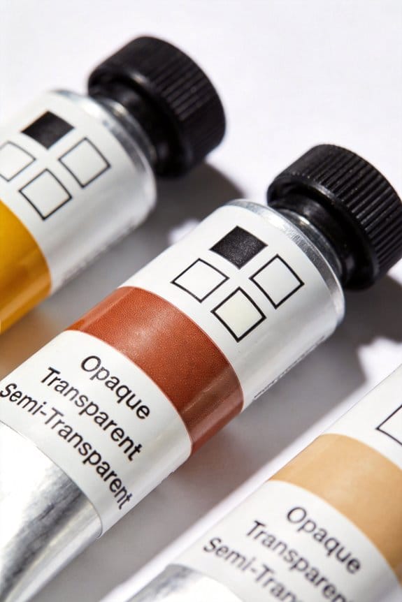
Reading paint labels can sometimes be a bit of a head-scratcher. You’re standing there in the aisle, trying to make sense of what all those little box symbols mean. So, let’s break it down: an empty box means transparency, and a solid black box indicates opacity. If you spot a diagonal line in the box, that tells you the paint is semi-transparent. Easy enough, right?
Sometimes, though, you might not see these indicators on the label. It’s a bit frustrating, but you can always check out the manufacturer’s website for details. Want to get a firsthand feel for how a paint performs? Try applying it on a dark surface. Opaque paints will cover up whatever’s underneath, while the transparent ones will let that color shine through. It’s a simple trick that helps ensure you get the right look for your project.
Honestly, knowing how to read these labels can save you a lot of time and headaches. It’s all about understanding what you’re working with to achieve the best results. Next time you’re choosing paint, just remember these tips, and you’ll be in good shape. What’s your go-to method for figuring out paint types?
Also, considering the lightfastness indicated on paint labels is crucial to ensure your artwork remains vibrant over time.
Recommended Products

Features: Easy to label description area for each page, 10 removable pages with glassine interleaving, each swatch outline measures 1"x1.5", pages measure 9x12" from the spiral binding, exclusive to Jerry's Artarama, and patent pending swatch diary design

GANSAI TAMBI is traditional, Japanese watercolor, developing colors that are based off of those seen in nature. Colors are vivid and opaque, and pans are carefully fill so that the paint is smooth, rather than granulated, and dries with a slight sheen. Individual pans are replaceable.

𝗗𝘂𝗿𝗮𝗯𝗶𝗹𝗶𝘁𝘆, 𝗮𝗲𝘀𝘁𝗵𝗲𝘁𝗶𝗰 𝗮𝗻𝗱 𝗦𝗺𝗲𝗹𝗹 𝗣𝗿𝗼𝗼𝗳: Our Food Storage Containers are not only designed to protect your precious contents but they’re also designed to withstand breaks and drops. These screw top jars are great for travel, sampling, and storage. The airtight container plastic lid creates a smell-proof barrier, making it perfect for storing seasonings and other odorous goods.
The Importance of Transparency Levels in Painting
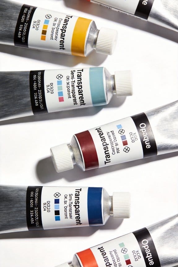
Have you ever stared at a canvas, frustrated with how flat your colors look? Understanding transparency levels in paint might just be what you need to breathe life into your artwork. The transparency of paint tells you how much light can pass through it, which really impacts how vibrant your colors appear.
When you’re shopping for paint, pay close attention to the labels on the tubes. An empty box means the color is transparent, a solid box indicates it’s opaque, and a diagonal line suggests something in between, or semi-transparent. Transparent paints allow for optical mixing, which creates those beautiful luminous layers that seem to glow. Meanwhile, opaque colors deliver solid coverage—great for adding texture and depth.
Want a quick tip? Try testing your paints on both black and white surfaces. It’s a simple way to get a good grasp of how transparent or opaque your colors truly are. This practice will help you choose the right type for whatever artistic goals you have in mind.
Honestly, knowing how to balance these transparency levels can transform your painting experience. So, what’s holding you back from experimenting with different paints? Dive in, and see how these concepts can elevate your painting skills!
Keep in mind that paint consistency and texture also influence how transparency affects your final work, so consider this when selecting your acrylics.
Recommended Products

Precision Dimensions — This clear extruded acrylic round tube measures exactly 9-3/4" (9.75") inner diameter x 10" outer diameter x 60" length, with tight tolerances of +/-0.010" for consistent and consistent performance. Sold as a single tube per pack, making it easy to order the exact quantity your project requires.
Precision Dimensions — This extruded acrylic clear round tube measures 7-3/4" (7.75") inner diameter x 8" outer diameter x 72" length, with tight tolerances of +/-0.010" for consistent, consistent in your application. Sold as 1 individual tube per pack, making it easy to order exactly the quantity your project requires.

ISC Helicopter-OG-HD Heavy Duty Surface Guard Tape is conformable and extremely strong 14-mil outdoor grade polyurethane tape. Also known as helicopter blade/leading edge wing tape, the thick film backing provides exceptional protection from tearing, punctures, erosion, and abrasion. ISC's surface guard tape also protects against extreme temperatures, ultraviolet light, and automotive solvents.
Pros and Cons of Transparent vs. Opaque Paints
Choosing between transparent and opaque paints can feel like a tough decision, right? Opaque paints give you that solid coverage, so if you’re into bold textures, you can really experiment with techniques like impasto. But keep in mind, those opaque colors may hide your previous layers. This can limit your creative options if you want to build on what you’ve already done—which can be a bummer.
On the flip side, transparent paints let you see through each layer. This can give your artwork incredible depth and that sought-after luminosity when mixing colors. Have you ever noticed how vibrant blends can almost glow? That’s one of the big perks of going transparent. Sometimes, you’ll even find semi-transparent paints, which balance the two and can be a nice middle ground.
So, when you’re planning your next project, ask yourself: what do you want your artwork to convey? If you’re looking for vivid blends and layers, transparent paints might be your best bet. But if you’re after a more muted look or want to create something with thicker texture, opaque could be the way to go.
Truth is, understanding the differences between these types of paints is key to maximizing your creativity. Many artists choose Liquitex acrylic inks for their lightfastness and archival quality, which preserves the vibrancy and longevity of their layered works. Ultimately, knowing the pros and cons will help you choose the right paint and achieve the effects you want. What’s your go-to choice when you want to make a statement in your art?
Recommended Products

Bonds on contact to paper stocks and other lightweight materials

Prized Paper - The long fibers in Arches natural white 100% cotton watercolor paper provide timeless beauty and an inimitable touch; this rich water color paper for artists is available in 2 sizes and 3 revered textures: cold press, hot press and rough

Overall Size: Approximately 80x40 inches (200x100 cm) in five pieces: 16"x24" 16"x31" 16"x39" 16"x31" 16"x24"; printed on Structured canvas 260g/m2 for superior quality; stretched over a sturdy wooden frame
Understanding Paint Tube Labels: Key Symbols and Terminology
When you’re browsing through paint tube labels, ever wondered what all those symbols mean? Knowing what they indicate can save you a lot of headaches when you’re choosing the right paint for your project. For example, a black box on the label means that paint is fully opaque, while an empty box signals that it’s extremely transparent. A diagonal line? That’ll tell you it’s semi-transparent, which falls somewhere in the middle. So, why does this matter? Understanding these transparency and opacity signs can really help you in narrowing down which paint will work best for your needs.
Now, let’s talk about lightfastness ratings—these are important too. Look for plus signs, as they show how well the paint will resist fading over time. The pigment number usually starts with a “P” and gives you insight into the specific pigment’s properties, like if it’s opaque or transparent. Here’s the trick: If you flip the paint tube over, you might find more details about opacity that aren’t listed on the front. This can really help you make a more informed choice.
Honestly, it’s easy to get overwhelmed with all the options out there. But if you keep an eye on these key indicators on the labels, you’ll make better decisions. Don’t hesitate to take a closer look; it could save you some time and frustration later on. Additionally, knowing how different mediums affect paint drying time can influence your choice of paint transparency for specific techniques.
Recommended Products

🎨 THE BRAND: Schmincke has been producing the best, finest artists' colors Made in Germany since 1881 and they are available in over 60 countries. The range includes watercolors, acrylics, oil colors, pastels, gouache colors, airbrush colors and much more.

🎨 THE BRAND: Schmincke has been producing the best, finest artists' colors Made in Germany since 1881 and they are available in over 60 countries. The range includes watercolors, acrylics, oil colors, pastels, gouache colors, airbrush colors and much more.

🎨 THE BRAND: Schmincke has been producing the best, finest artists' colors Made in Germany since 1881 and they are available in over 60 countries. The range includes watercolors, acrylics, oil colors, pastels, gouache colors, airbrush colors and much more.
Best Practices for Using Transparent and Opaque Paints
Have you ever wondered why some paintings just pop while others seem flat? The way you use transparent and opaque paints can really change the whole vibe of your artwork. It’s all about how light interacts with the colors! Transparent paints let light shine through, giving your pieces a beautiful glow, while opaque paints cover the canvas fully and can really pack a punch.
So, how do you know what you’re working with? Check the labels on your paint tubes! An empty box means a paint is transparent, a solid box signifies opacity, and a diagonal line indicates semi-transparency. Understanding this can make a big difference in your painting technique.
If you’re looking to create thick, textured strokes, grab the opaque paints. They’ll help you achieve that impasto look where the texture becomes part of the artwork. On the flip side, transparent paints are your best friend for layering. They help you mix colors optically, which means you can create depth without making your piece look muddy.
Here’s a trick: test your paints over a black line on a scrap piece of paper. This little experiment shows you how opaque or transparent your colors really are, helping you choose the right ones for your project. Plus, many paint manufacturers provide great info about lightfastness and mass tone. Don’t skip out on those resources; they can really help you level up your skills.
Honestly, playing with different styles and techniques can lead to some unexpected discoveries in your art. You might even find a new favorite method! So, why does this matter? Because every little detail in your painting can lead to a more compelling piece. Think about what you want to achieve next in your artwork. Are you ready to dive into experimenting with transparent and opaque paints? Also, remember that fast-drying acrylics can help you build layers quickly without long waiting times, making your workflow more efficient.
Recommended Products

Schmincke - HORADAM® AQUARELL, elegant beech wood case, 80 x 5 ml tubes, finest artists' watercolors
🎨 THE BRAND: Schmincke has been producing the best, finest artists' paints Made in Germany since 1881, which are available in over 60 countries.

Holbein Artists' Watercolor - Assorted Colors, Set of 60, 5 ml

🎨 THE BRAND: Schmincke has been producing the best, finest artists' colors Made in Germany since 1881 and they are available in over 60 countries. The range includes watercolors, acrylics, oil colors, pastels, gouache colors, airbrush colors and much more.
Frequently Asked Questions
How to Read a Paint Tube?
To read a paint tube, let’s examine the paint types, pigment properties, and lightfastness ratings. We’ll also consider the tube composition and paint ingredients for effective color mixing and best paint application and color saturation.
Should Opacity Be High or Low?
Like a painter choosing brushes, we should balance opacity levels. High opacity enhances canvas covering and visual contrast, while low opacity enriches color mixing and artistic layering. Our materials choices shape the artwork’s ultimate impact.
How Should the Color Tube Be Viewed?
We should view the color tube considering color perception and pigment properties. Understanding how light interaction influences paint application helps us make artistic choices, enhancing color mixing and creating desired visual effects throughout our artwork.
What Does High Opacity Mean in Paint?
High opacity in paint means it covers surfaces completely, allowing us to create vibrant hues without unwanted texture influence. With strong pigment strength and lightfast qualities, we enjoy efficient application techniques and quick drying times during color mixing.


